Loveneet singh
Enterprise AI vs Generative AI - Benefits, Differences, Challenges
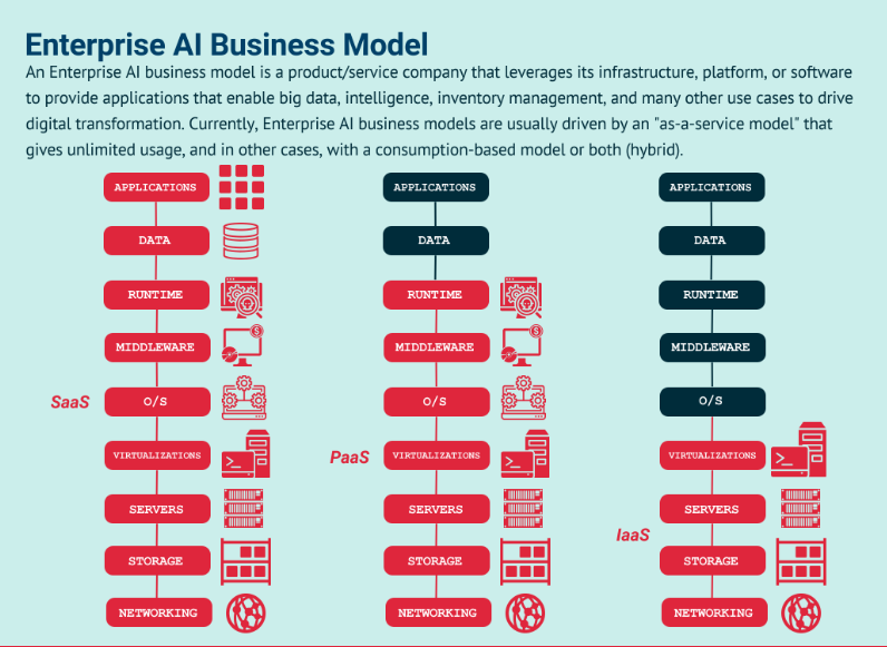
Enterprise AI vs Generative AI
In the present day and age, Digital Transformation has become the paramount priority in virtually every sector, and this process continues to progress at a rapid pace. Organizations that once relied solely on manual operations are now gradually embracing automated methods. And, all this is possible due to the integration of generative AI .
Since more and more companies start investing in AI, Enterprise AI, and Generative AI have emerged as the two sides of a coin. Now, you might be wondering what exactly are Enterprise AI and Generative AI.
Well, in the short term, we can say that Enterprise AI is a machine learning and artificial intelligence application used for routine business activities, whereas Generative AI utilizes machine learning and artificial intelligence to enable machines to synthesize existing content on the web and generate counterfeit content such as audio, video, text, and images. The benefits of Enterprise AI to society are distinct from those of Generative AI.
Understanding the key differences between these two types of AI is important for businesses looking to leverage AI technologies to enhance their operations. In this article, we will explore the key differences and benefits of enterprise AI and generative AI. So, let’s take a look!
Enterprise AI vs Generative AI Explained
1. Enterprise AI, also known as business AI, is artificial intelligence that focuses on enhancing business operations, performance, and efficiency. It involves the use of data analysis, machine learning algorithms, and automation tools to solve complex problems and streamline various tasks.
Enterprise AI Benefits
Enterprise AI can assist businesses in enhancing customer support, which can be a powerful tool for driving sales. By leveraging virtual chatbots, monitoring customer behavior, and enhancing customer-business interactions, enterprises can improve their support offerings, and drive sales.
As marketing is a significant contributor to business growth, Enterprise AI can help develop innovative marketing strategies that would be challenging to achieve with traditional techniques. Therefore, businesses can leverage this technology to create a competitive edge in the market and drive growth.
- Enhance Efficiency: Enterprise AI helps to automate repetitive and time-consuming tasks, allowing employees to focus on more critical and creative tasks.
- Improve Decision-Making: By leveraging data analysis, Enterprise AI provides insights and predictions that enable better decision-making and risk management.
- Enhance Customer Experience: With Enterprise AI, businesses can provide personalized and efficient customer service, increasing customer satisfaction.
- Cost Savings: By automating tasks and improving operational efficiency, Enterprise AI helps businesses reduce costs and increase profitability.
- Competitive Advantage: Businesses that adopt Enterprise AI can gain a competitive advantage by optimizing their operations and delivering better products and services to customers.
For instance, AI-powered fraud detection systems can analyze transactions and identify potential fraudulent activity before it occurs.
2. Generative AI, also known as creative AI, is a type of artificial intelligence that focuses on creating new content, such as art, music, or text, that can be used for various purposes. Generative AI uses neural networks, natural language processing, and other techniques to generate new content based on existing patterns and structures. Here are some benefits of Generative AI
Generative AI Benefits
Leveraging Generative AI can enable businesses to automate tasks and save valuable resources such as time and money. Moreover, it can enhance the efficiency of operations, thereby delivering a positive impact on overall business performance.
Notably, one of the key benefits of this technology is the ability to create relevant images aligned with the text in real time, a feature that marketers can leverage to create brand awareness and hype. Beyond efficiency, Generative AI also promises to deliver high-quality output in the form of audio, video, images, and text.
- Improve Creativity: Generative AI can help humans generate new ideas and concepts by providing new perspectives and insights.
- Increase Productivity: By automating the creative process, Generative AI can help artists, musicians, and writers produce more content in less time.
- Personalization: Generative AI can create personalized content tailored to individual preferences and interests, leading to higher engagement and satisfaction.
- Innovation: Generative AI can generate new and innovative solutions to complex problems, leading to breakthroughs in various fields.
- Accessibility: Generative AI can democratize the creative process by making it accessible to a wider audience, regardless of their background or skill level.
For example, a fashion retailer can use Generative AI to create personalized product recommendations for customers, based on their preferences and browsing history.
A graphic designer can use Generative AI to create new design elements, such as textures or patterns, that can be used in various projects.
Both Enterprise AI and Generative AI offer significant benefits for businesses and individuals. By understanding the benefits and limitations of each approach, businesses and individuals can leverage AI to achieve their goals and gain a competitive advantage in today's rapidly evolving business landscape.
Key Differences Between Enterprise AI & Generative AI
As previously noted, Generative AI and Enterprise AI differ in their approaches to streamlining human tasks. These technologies employ distinct techniques to achieve this goal.
1. Enterprise AI utilizes techniques such as Heuristics, Natural Language Processing (NLP), Machine Learning, Support Vector Machine, Markov Decision Process, and Artificial Neural Networks (ANN).
Heuristics, a technique based on the trial-and-error method, is a prominent technique used in Enterprise AI to solve complex business problems. NLP is a technique utilized by voice assistants to capture and process text, and then convert it into audio. This popular technique is widely used in Microsoft Word to facilitate enterprise activities.
Artificial Neural Networks (ANN) work similarly to natural neural networks and assist enterprises in detecting complex patterns in a given dataset. Machine learning is programmed to learn from previous experiences and execute specific enterprise tasks.
The Markov Decision Process technique is based on the decision-making process and indicates which actions should be taken by the machine in a given situation and at what time.
2. Generative AI employs techniques such as Generative Adversarial Networks (GAN), Transformers, and Variational Auto-Encoders. GANs utilize two neural networks, discriminators and generators, which function in opposition to each other to seek out patterns in the networks.
Transformers in Generative AI are trained to understand images, audio, text, language, and data classification. Wu-Dao, GPT-3, and LAMDA are examples of transformers that measure input data differently based on its importance. The input data undergoes compression into code, which is then decoded by the transformer to produce the actual information. All of this is accomplished via variational auto-encoders.
Enterprise AI & Generative AI Challenges
Generative AI has become prominent and troublesome. With the ability to create convincing models of genuine individuals, Generative AI can be used to perform a variety of crimes. The repercussions of such actions could be fatal, disrupting entire workforces and causing chaos.
Unfortunately, mischievous individuals have already begun to exploit the technology for their own gains, using it to imitate others for disreputable purposes such as blackmail, revenge, or ransom. one of the significant challenges is that people are using it to propagate falsehoods and create fake stories, instead of harnessing its power for constructive purposes.
Enterprise AI's adoption in the organization is not as easy as one thinks. It comes with many perks, but challenges must also concern the budget. The integration of Enterprise AI is an expensive affair, and small-scale industries are worried about implementing it.
Considerations for selecting Enterprise AI or Generative AI
As businesses across various industries look to leverage Artificial Intelligence (AI) to improve their operations, choosing the right approach can be a challenging task. With Enterprise AI and Generative AI being the two most common approaches, it is essential to understand the considerations for selecting one over the other, as well as the factors that influence the decision-making process.
Here, we will explore both of these topics to help businesses make informed decisions when selecting an AI approach.
- Purpose: The first consideration is the purpose of the AI implementation. Is it to solve specific business problems or create new content? Enterprise AI is best suited for problem-solving, while Generative AI is ideal for Content Strategy.
- Industry: Different industries have unique needs and requirements when it comes to AI. Consider the nature of your business and whether it requires a more problem-solving or content-creation approach.
- Data Availability: The availability and quality of data play a significant role in the selection process. Enterprise AI requires significant amounts of structured data, while Generative AI can work with less structured data.
- Resource Availability: Both approaches require different levels of resources, including financial, technical, and human. Consider whether your business has the resources to implement and maintain the chosen approach.
Factors that influence the decision-making process
Choosing the right AI approach for your business requires careful consideration of various factors. Whether you opt for Enterprise AI or Generative AI, ensure that the approach aligns with your business goals, industry, available resources, and ethical considerations. By doing so, you can leverage the benefits of AI to improve your business operations and stay ahead of the competition.
- Business Goals: The first factor is the business goals that AI aims to achieve. Does the business seek to improve productivity, reduce costs, or create new revenue streams? The choice of AI approach should align with these goals.
- Technical Expertise: Implementing an AI approach requires technical expertise. Consider whether your business has the necessary expertise or whether it needs to outsource to a third party.
- Timeframe: The timeframe for implementing AI can vary depending on the approach selected. Consider the urgency of the business needs and the time available to implement the chosen approach.
- Ethical Considerations: AI can raise ethical considerations, such as data privacy, fairness, and bias. Consider the ethical implications of the AI approach selected and whether they align with the business's values.
Takeaway
Choosing the right AI approach for your business requires careful consideration of various factors, including your business goals, data availability, budget, and resource availability. Enterprise AI and generative AI are two popular approaches to AI that offer different benefits and challenges.
Enterprise AI is focused on solving problems and improving operational performance, while generative AI is geared toward creating new content. Both approaches can bring significant benefits to your business, including increased efficiency, productivity, and innovation.
It is important to choose the approach that aligns with your business goals, industry, and available resources. By leveraging the power of AI, your business can stay ahead of the competition and unlock new opportunities for growth and success. RedBlink, a leading Generative AI Development Company located in United States, specializes in building generative AI solutions. Our innovative approach and advanced generative AI applications drive growth and fuel innovation.
Are you ready to unlock the true potential of artificial intelligence for your enterprise? Look no further than RedBlink's AI consulting services. With their deep expertise in Generative AI and related niches, we provide unparalleled guidance and support. From developing customized AI solutions to optimizing existing frameworks, RedBlink empowers businesses to harness the power of cutting-edge technology.
References
- G. Marcus, "Deep Learning: A Critical Appraisal," arXiv preprint arXiv:1801.00631, 2018.
- S. Ruder, "An Overview of Multi-Task Learning in Deep Neural Networks," arXiv preprint arXiv:1706.05098, 2017.
- C. Sutton and A. McCallum, "An Introduction to Conditional Random Fields for Relational Learning," Introduction to Statistical Relational Learning, MIT Press, 2010.
- A. M. Dai and Q. V. Le, "Semi-supervised Sequence Learning," in Advances in Neural Information Processing Systems (NIPS), pp. 3079-3087, 2015.
- I. Sutskever, O. Vinyals, and Q. V. Le, "Sequence to Sequence Learning with Neural Networks," in Advances in Neural Information Processing Systems (NIPS), pp. 3104-3112, 2014.
- K. He, X. Zhang, S. Ren, and J. Sun, "Deep Residual Learning for Image Recognition," in Proceedings of the IEEE Conference on Computer Vision and Pattern Recognition (CVPR), pp. 770-778, 2016.
- H. Zhang, M. Cisse, Y. N. Dauphin, and D. Lopez-Paz, " Beyond Empirical Risk Minimization," in International Conference on Learning Representations (ICLR), 2018.
Generative AI in Healthcare - Benefits, Applications & Use Cases
Generative AI in Healthcare
Were you aware prior to 2024 of the potential impact that Artificial Intelligence (AI) and machine learning could have on the healthcare industry?
It’s true that these technologies are influencing healthcare outcomes significantly. The use of generative AI provides insight into patterns and trends in data, which can be used to develop new medical discoveries.
According to Statista, the global market for Artificial Intelligence (AI) in healthcare will reach $188 billion by 2030. There are obvious reasons for this.

With the development of generative AI in product design, it becomes possible for healthcare providers to offer more personalized care, enhance patient outcomes, and reduce costs. However, the implementation of AI in healthcare poses its own set of challenges, and ethical considerations that must be taken into account to ensure the safety and privacy of patients.
In the healthcare industry, generative AI is not just a technological advancement but a paradigm shift in patient care and medical innovation. This groundbreaking technology is being adopted by a wide spectrum of healthcare stakeholders, including providers, pharmaceutical companies, biotech firms, insurers, and payers. The overall goal is to revolutionize patient interaction and care.
In this article, we will explore the exciting potential of generative AI in healthcare, the challenges involved in its implementation, and the ethical considerations that need to be addressed. Join us as we delve into the fascinating world of AI and its impact on the future of medicine.
In the following guide, we are also going to explore the exciting and varied applications of generative AI in healthcare and witness how it's setting the stage for a future where healthcare is more personalized, efficient, and innovative.
Generative AI in Healthcare: Stats & Facts
A significant transformation is about to take place in the sphere of healthcare thanks to generative AI.
This isn't just a bold statement; it's a forecast supported by robust data.
By 2032, the global generative AI market in healthcare is projected to reach a staggering $17.2 billion. Such growth reflects the monumental impact AI is expected to have on this vital sector.
While over 25% of scientists believe artificial intelligence will play a crucial role in healthcare by 2033, they worry about potential shortcomings like high costs, stringent regulations, and AI hallucinations, which can cause a lack of accuracy and misinformation. These factors could affect the reliability and adoption of AI technologies in healthcare.
Patient perception is another crucial aspect. Research shows that the quality of care can affect financial measures by 17% to 27%. The stakes are high: negative word-of-mouth spreads about a hospital or health system, potentially amounting to $400,000 across a patient's lifetime.
Moreover, the sheer volume of data in healthcare is staggering. An average hospital generates about 50 petabytes of data every year. To put this into perspective, this amount equates to roughly 12.5 trillion digital copies of the King James version of the Bible. Even more astounding is the annual growth rate of healthcare data, which stands at 47% per year. This exponential increase underscores the necessity and potential for AI-driven data management and analysis.
The increasing prominence of generative AI in healthcare is further evidenced by market projections. By 2032, the global market for this technology is expected to surge to an impressive $118.06 billion. This underscores the transformative capacity of generative AI to overhaul healthcare workflows and operations, making it a pivotal element in the future of healthcare.
These stats indicate that generative AI in healthcare not only revolutionizes healthcare practices but also profoundly impacts patient outcomes and institutional efficiencies. ‘
Benefits of Generative AI in the Healthcare Industry
Generative AI is reshaping healthcare, offering solutions from enhancing patient communication to pioneering new drug discoveries. It addresses challenges such as patient engagement, compliance with privacy laws like HIPAA, and simplifying complex administrative processes. By providing personalized, relevant information, generative AI empowers patients and providers alike, streamlining communications for more effective healthcare delivery.
Beyond communication, generative AI deepens into electronic health records (EHR), opening up vast opportunities in diagnosis, treatment, and drug innovation. These applications extend far beyond typical patient interactions, signaling a new frontier in healthcare.
In the following section, we will dive into the multifarious objectives of AI in healthcare.
1. Improve Diagnostic Processes
AI can significantly improve the diagnostic processes in healthcare when analyzing prodigious data and identifying intricate patterns and trends that are imperceptible to human clinicians.
Its adaptability and ability to learn can provide valuable insights, resulting in better-informed decisions for clinicians to diagnose patients. As opposed to human clinicians, AI systems can detect and diagnose diseases at a quicker pace and with minimal error.
2. Reduce Overall Healthcare Costs
AI integration services in healthcare promises to cut costs and improve patient outcomes. By automating tasks and workflows, providers save resources and identify system inefficiencies, reducing waste.
Healthcare providers can allocate resources to enhance patient access and invest in new technologies and treatments. AI in clinical trials accelerates drug discovery and lowers investment. AI proves crucial in driving healthcare innovation to deliver better care at lower costs.
3. Personalize Treatment Plans
AI in healthcare aims to personalize treatment plans for patients to analyze vast amounts of data and identify patterns and trends. This can lead to more effective treatments, improved patient outcomes, and higher satisfaction rates.
AI can continuously monitor patients and adjust treatment plans as needed, revolutionizing how we approach healthcare and enhancing the quality of life for patients.
4. Enhance Treatment
AI has revolutionized healthcare and enabled effective treatment plans, personalized medication and therapy identification, and real-time monitoring of patient responses.
It has also accelerated drug discovery, identifying the most promising drug targets for various diseases and reducing the time and costs associated with clinical trials. This has led to better patient outcomes and increased efficiency in the healthcare industry.
5. Improve Patient Outcomes
AI, utilizing neural networks, is now an essential tool in drug discovery, enabling researchers to identify the best drug targets and reducing investment, and expediting clinical trials.
Moreover, AI assists healthcare providers in making informed treatment decisions by remotely monitoring patients and providing valuable insights into their conditions. This results in improved patient outcomes and satisfaction.
6. Drive Innovations
The integration of AI in healthcare has the potential to drive significant innovations, leading to the development of personalized treatments, innovative healthcare services, and novel diagnostic tools.
In fact, AI can help healthcare providers identify and address healthcare disparities, improve patient engagement and communication, and transform the healthcare industry, resulting in a higher quality of care and overall patient outcomes.
7. Reduce Costs
Reducing healthcare costs is a significant objective of implementing AI in the healthcare industry. The use of AI can help automate administrative tasks, reduce inefficiencies, and minimize errors, resulting in significant cost savings.
AI can help healthcare providers identify high-risk patients, prevent unnecessary hospitalizations and readmissions, and optimize treatment plans. Hence, it leads to more effective and cost-efficient care.
8. Safer Surgeries
AI can assist healthcare providers in planning and executing surgeries by analyzing data from medical imaging and other sources, identifying potential risks and complications, and helping to optimize surgical techniques.
This can result in better surgical outcomes, reduced complications, and improved patient safety. Besides, AI can assist with post-surgical care, monitoring patients for signs of complications and alerting healthcare providers to potential issues.
9. Easy Information Sharing
AI can help to streamline the exchange of patient data and medical records among healthcare providers, improving communication and collaboration. This can lead to more efficient care, reduced medical errors, and better patient outcomes.
Further, AI-powered tools can help to identify potential drug interactions, which can improve patient safety and prevent adverse events. This way AI can improve patient experience and overall quality of care through seamless information sharing.
Artificial intelligence (AI) has the capability of analyzing vast amounts of data and identifying patterns and trends that would be challenging for human clinicians to detect. This technology has the potential to transform healthcare by providing valuable insights to healthcare providers to make more informed decisions, resulting in better patient care.
Healthcare providers can improve patient outcomes, reduce costs, and increase efficiency. This section will explore the various ways in which generative AI can be used in healthcare and the associated benefits and challenges.
Applications and Use Cases of Generative AI in Healthcare
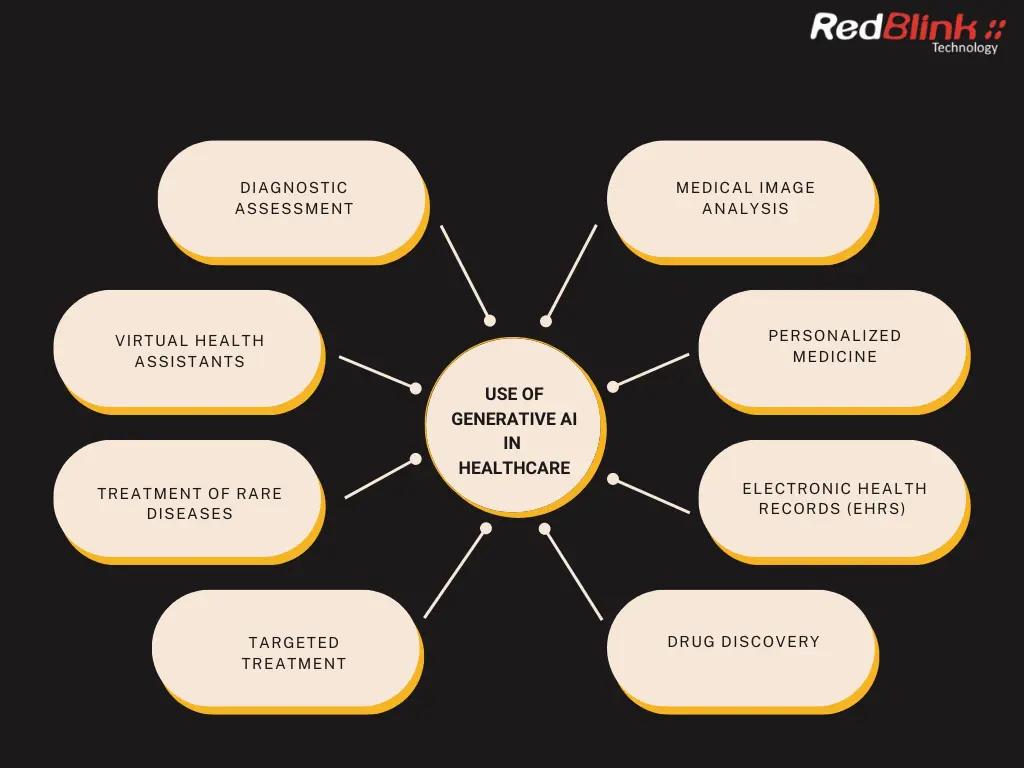
Here are a few capabilities of AI in the field that we find the most exciting along with examples of groundbreaking healthcare AI companies.
1. Personalized Patient Care
One of the most powerful capabilities of generative AI in healthcare is offering tailored recommendations and individual support. These relate both to offering psychological and physical care assistance, like drug use instructions. Here are some examples:
(a) LLM-Powered Diagnosis of Thought (DoT) in Psychotherapy:
The researchers at Carnegie Mellon University and the University of California have developed a Diagnosis of Thought (DoT) prompting system. This system utilizes Language Learning Models (LLMs) to analyze patients' speech, skillfully distinguishing emotional expressions from factual statements.
The primary goal is to aid psychologists in crafting more accurate and effective treatment plans. The DoT system excels in identifying contradictory thoughts, enabling healthcare professionals to detect cognitive distortions in patients.
Artificial Intelligence (AI) has the capacity to analyze vast quantities of data from Electronic Health Records (EHRs), radiography, CT scans, and magnetic resonance images. Through a comparative analysis of data across patients, AI can detect patterns and identify associations that can help predict early symptoms.
Electronic Health Records (EHRs) are a valuable source of patient data that can be leveraged with the help of generative AI. AI systems can analyze EHRs to identify patterns and trends in patient health, which can aid healthcare providers in making more informed decisions and providing better care.
Generative AI can assist in the development of personalized treatment plans based on patient-specific data, leading to improved patient outcomes.
However, there are also concerns about patient privacy and data security when it comes to the use of EHRs and generative AI. To ensure ethical implementation, healthcare providers must carefully consider these issues and implement robust security measures to protect patient data.
(b) AI-Powered Companions for Senior Patients:
New York State’s Office for the Aging is testing ElliQ, a digital companion designed for elderly patients. Developed by Intuition Robotics, ElliQ is described as a “sidekick for healthier, happier aging.”
A study conducted by the state in mid-2023 revealed that an impressive 95% of ElliQ users reported a significant reduction in feelings of isolation, along with an uplift in their overall mood.
New York State is planning to further invest approximately $700,000 in 2024, covering setup costs, maintenance, and ensuring robust device security for patients under the care of the Office for the Aging.
(c) Customized Nutritional Plans and Monitoring Through AI Analysis:
The development of AI-driven platforms for creating personalized nutritional plans is a testament. These systems analyze individual health data, dietary preferences, and lifestyle factors, delivering highly tailored nutritional recommendations.
A notable example is Nutrino, an AI-powered health and nutrition platform that provides personalized meal plans based on an individual's unique health profile and goals.
Users of such AI-nutritional programs experienced a 25% improvement in adherence to dietary guidelines compared to traditional methods. In the realm of healthcare, virtual health assistants, such as Sense.ly and AiCure, are intelligent assistants, which are capable of handling an impressive array of tasks.
Whether it be answering routine patient calls and emails, safeguarding sensitive medical information, scheduling appointments with doctors, or reminding patients of follow-up visits, virtual health assistants are adept at providing patients with a personalized experience that addresses their unique health needs and concerns.
In essence, virtual health assistants represent one of the most useful and impactful applications of AI in the healthcare industry today.
2. Clinical Diagnosis
Medical professionals can use generative AI in healthcare to analyze vast amounts of clinical data to make better diagnoses. With this technology, there are fewer chances of mistakes occurring due to distractions or fatigue.
BERG, a clinical-stage biotech platform, owned by BPGbio, is leveraging the power of artificial intelligence (AI) to develop cutting-edge drugs and vaccines for rare diseases such as cancer. An innovative approach combining research and development with interrogative biology will revolutionize healthcare by mapping diseases and accelerating the discovery of effective treatments.
With its advanced technology and scientific expertise, BERG is creating robust products that offer hope to patients in need. Through the use of AI, medical practitioners can gain a better understanding of diseases and develop more targeted therapies, ultimately improving patient outcomes.
With the help of artificial intelligence and advanced biological techniques, BERG is paving the way for a more resilient and healthier future through the fight against rare diseases.
(a) AI-Powered Healthcare Search Experience for Doctors:
Google's late 2023 announcement of a specialized GenAI search experience, tailored for healthcare professionals, marks a significant advancement.
Doctors can quickly access patient records with ease thanks to Vertex, the AI search platform provided by the company. It will also save them a lot of time by preventing them from jumping between different platforms.
(b) Pancreatic Cancer Diagnosis:
In a recent study published in Nature Medicine, a team of more than 35 experts introduced a new technology for detecting pancreatic cancer, cleverly named PANDA. Using AI to analyze CT scans, they successfully identified pancreatic cancer more accurately than your typical radiologist.
PANDA demonstrated an impressive performance, achieving a 92.9% accuracy in analyzing CT scans for cancer-positive cases and an outstanding 99.9% accuracy for non-cancer cases. This is now being considered a cost-effective method for screening large groups of asymptomatic patients.
(c) Early Detection of Neurodegenerative Diseases:
AI systems are now capable of analyzing subtle patterns in patient data that might elude even the most experienced clinicians.
This ability is particularly crucial in neurodegenerative diseases, such as Alzheimer's and Parkinson's. Recent statistics are promising. Studies have shown that AI can identify Alzheimer's disease up to six years before clinical diagnosis with an accuracy of over 80%.
3. Drug Discovery and Development
AI is adept at sifting through immense datasets, identifying complex patterns far beyond human capability. Its speed and precision are pivotal in recognizing potential drug candidates, thereby accelerating the drug discovery process.
AI has become a vital tool in drug discovery. Using neural networks, AI can assess the bioactivity and properties of drug candidates and help researchers identify the most promising drug targets for various diseases.
This has led to an increase in the speed of clinical trials and a reduction in the investment required for drug discovery. The use of AI in the selection of the right candidates has proved to be invaluable, and the healthcare industry has benefited significantly from its implementation.
With the help of cutting-edge technologies, BenevolentAI - a leading, clinical-stage drug discovery company - is able to provide precise treatment to the right patients at the right time, resulting in targeted care and actionable insights through the use of Deep Learning and Artificial Intelligence.
The company's focus is on securing licensing for its proprietary drugs and developing portable remedies for rare illnesses, demonstrating its unwavering commitment to enhancing patient care and fostering innovation in the healthcare industry.
(a) AstraZeneca and AI in Cancer Treatment:
A groundbreaking partnership has emerged between AstraZeneca, a titan in the pharmaceutical industry, and Absci Corporation, a leader in generative AI antibody discovery.
Their joint venture is focused on crafting an AI-designed antibody, with the noble aim of treating cancer more effectively. The objective of this collaboration is to speed up the development of a drug that will be beneficial to cancer patients.
(b) Improve Speed and Safety of Drug Development:
Imagin a future where AI creates an exact digital twin of human cells. Such a breakthrough is being pursued by Priscilla Chan and Mark Zuckerberg, who are working on a virtual cell modeling system, powered by AI.
This technology makes patient diagnosis, treatment, and drug discovery faster and easier.
(c) Rare Disease Research:
Rare diseases, affecting fewer than 200,000 individuals per disease, present unique challenges due to limited data and complexity.
However, AI's capacity to analyze vast datasets and uncover hidden patterns is proving invaluable. For instance, according to the National Institutes of Health, there are approximately 7,000 known rare diseases, affecting an estimated 25-30 million Americans. Generative AI is fast-tracking the discovery of treatments for these conditions, offering a ray of hope to millions.
4. Restoration of Lost Capabilities
AI's potential to interpret and respond to complex signals offers immense promise for restoring lost abilities like speech and mobility. As AI systems continue improving, they could revolutionize neurotechnology rehab and empower patient abilities through personalized technologies tuned to individual needs. Some applications include:
(a) Communicate via Brainwaves:
Researchers from GrapheneX-UTS Human-centric Artificial Intelligence Centre at the University of Technology Sydney have built a system that enables paralyzed individuals to communicate with others.
Imagine a cap that can decode silent thoughts and translate them into text. It’s a gateway to renewed connection for those who've lost their voice due to stroke, paralysis, or accidents. Beyond personal communication, this technology also provides seamless human-machine interactions – think of controlling bionic hands through thought.
(b) Restore Movement in Paralysis:
The Feinstein Institutes for Medical Research at Northwell Health is breaking barriers in bioelectronic medicine. Their team, comprising researchers, engineers, and surgeons has implanted microchips into the brain of a person who suffered from tetraplegic, which is four limbs paralysis.
They utilized AI algorithms to create a digital bridge between the brain and the spine. This approach reestablished control over hand movements and sensation.
Generative AI can help in the development of personalized medicine, a treatment approach that takes into account an individual's genetic, environmental, and lifestyle factors.
Through analyzing large datasets, generative AI can identify patterns and trends in a patient's health history and predict how they will respond to certain treatments. This can lead to more effective treatments and better patient outcomes.
Generative AI is an effective option for developing individualized drug regimens and dosages, further improving patient care. As the field of genomics continues to advance, the potential for generative AI to transform personalized medicine and improve patient outcomes is significant.
(c) Visual Impairment Assistance:
AI provides support for visually impaired individuals by enhancing navigation and recognition capabilities.
Vision tech software interprets visual data and conveys information through audio, significantly aiding face recognition, text reading, and real-time navigation.
5. Medical Training and Simulations
Thanks to AI, medical students and professionals can now get hands-on training without being physically present at the hospital or in the operating room.
Through AI-powered training and treatment simulations, healthcare professionals can practice and learn new skills in an interactive and engaging virtual environment. These technologies are frequently paired with VR/AR headsets to make the experience even more realistic, mimicking the feel of actual situations.
(a) Simulation-Based Learning (SBL) for Medical Students:
Western Michigan University is now using AI-driven simulation-based learning (SBL) in its medical studies curriculum.
This innovative approach provides students with over 100 hours of highly realistic simulations, involving them in diverse clinical scenarios. At the university’s state-of-the-art Simulation Center, professors provide feedback after each fictional medical intervention.
This process not only enhances their practical skills but also deepens their clinical understanding, preparing them for real-world medical challenges.
(b) Surgery Simulations:
Touch Surgery offers a groundbreaking AI-enabled simulation platform. This innovative software boasts an extensive library of over 200 surgical procedure simulations, covering an impressive range of 17 medical specialties.
These simulations are rooted in actual surgical recordings, providing an authentic and immersive educational experience. Clinics can upload their surgical videos, either from external storage devices or through seamless integrations with laparoscopic and robotic surgical systems.
For the highest level of privacy and security, AI also blurs patients' identities automatically.
(c) Virtual Reality in Surgical Training and Patient Education:
VR offers a safe environment for surgeons to practice complex procedures, essential for mastery as research suggests up to 100 repetitions are needed.
Studies, including one from the Journal of the American Medical Association, show VR-trained surgeons are quicker and more accurate, underlining its value in improving surgical skills.
Additionally, VR can increase patient understanding of medical procedures, enhancing doctor-patient communication and facilitating informed decision-making.
6. Automate Administrative Tasks in Healthcare
Generative AI plays a crucial role in healthcare not just for medical tasks but also in the administrative domain.
It assists professionals by making it easier to find information, eliminating a significant amount of manual work. This, in return, lowers the chances of errors.
(a) Streamline Operations and reduce inefficiencies:
A prime example of AI's transformative role in healthcare administration is the collaboration between GE HealthCare and Mass General Brigham.
Their joint venture centers on developing an AI algorithm aimed at bolstering the effectiveness and productivity of medical operations. Their initial focus is on the Radiology Operations Module (ROM).
This innovative digital imaging tool is designed to optimize scheduling, ultimately reducing costs and administrative workload. It also allows them to dedicate more attention to patient care, thus enhancing the quality of healthcare services.
(b) Medical Imaging Data Analysis with AWS:
Amazon's launch of an AI-driven health imaging solution on AWS represents a breakthrough in healthcare technology. This AI-powered health imaging solution simplifies large-scale medical image storage, processing, and analysis.
Amazon's HealthImaging app demonstrates significant economic advantages, including a potential 40% reduction in medical image storage costs, crucial in healthcare software types.
This advancement not only highlights AI's potential for cost savings in healthcare but also its ability to improve and speed up medical imaging, leading to better patient care and increased operational efficiency.
Generative AI has proven to be a valuable tool in medical image analysis. By analyzing medical images, generative AI can identify patterns and abnormalities that may be difficult to detect by the human eye.
This technology can also help identify markers for specific diseases, which can aid in early detection and treatment. Generative AI can be utilized in various medical imaging modalities, including Magnetic resonance imaging (MRI), CT scans, and X-rays, to provide more accurate and efficient diagnoses.
The use of generative AI in medical image analysis can lead to better patient outcomes, increased efficiency, and reduced costs in the healthcare industry.
(c) Enhance Patient Record Management and Data Security:
AI streamlines the organization, storage, and retrieval of healthcare data, handling large volumes with efficiency and accuracy - essential in a field where errors can have major implications.
Additionally, AI enhances data security against increasingly sophisticated cyber threats. It monitors patterns, detects anomalies, and alerts to possible breaches, a proactive approach vital for patient trust and regulatory compliance.
The importance of AI in this domain is underscored by market projections. The healthcare cyber security market, as per a MarketsandMarkets report, is expected to hit $35.3 billion by 2028, growing at a CAGR of 14.2% from USD 18.2 billion in 2023.
7. Public Health Contribution
Generative AI stands as a crucial ally in public health management. Its ability to rapidly process extensive datasets enables it to identify and predict public health challenges, including potential disease outbreaks.
This capability positions AI as an essential tool for preemptive public health strategies, serving as an advanced warning system that can save countless lives.
(a) Real-Time Data Analysis for Disease Outbreak Prevention:
The challenge of mitigating health, economic, and societal issues caused by disease outbreaks demands swift and accurate data. For instance, BlueDot’s innovative tool harnesses the power of AI to transform data analysis.
Utilizing technologies like Cohere Classify and Cohere Rerank, it provides an interactive interface rooted in natural language processing. This system delivers rapid, real-time infectious disease intelligence, reducing data processing time from days to mere minutes.
(b) Tackle Illegal Drug Trafficking:
The increasing illegal drug trafficking in the U.S., notably of substances like fentanyl, poses a major public health challenge. Many of these drugs come from Latin America, highlighting the importance of border control.
To tackle this, Altana has strengthened its partnership with U.S. Customs and Border Protection (CBP), using AI-powered analytics to provide a detailed map of the global supply chain.
This helps identify potential illegal fentanyl producers and is crucial in combating drug trafficking, while also promoting secure and reliable global trade networks.
(c) Vaccination and Treatment Strategies:
In vaccination and treatment strategy optimization, the real-time analysis through Generative AI of health data aids in identifying at-risk regions, enhancing vaccine distribution, and creating population-specific treatment plans.
For example, AI predicted COVID-19 spread, aiding resource allocation, and informed vaccination strategies by considering factors like population density and health infrastructure. This ensures efficient vaccine distribution to vulnerable groups.
Additionally, AI's role in treatment strategies is notable; it personalizes treatments based on patient data, improving outcomes in chronic diseases where standard treatments may fall short.
8. AI-Driven Biotech Innovations
The integration of Generative AI in biotechnology is forging new frontiers in tissue engineering and the development of personalized biologics, marking a transformative era in healthcare.
(a) Tissue Engineering and Regenerative Medicine:
AI is revolutionizing tissue engineering by enhancing precision in 3D bioprinting and optimizing tissue models. Leveraging vast datasets, AI algorithms design tissue structures with improved accuracy, crucial for successful transplants and disease models.
A study by the University of Toronto noted an increase in precision with AI-assisted tissue engineering, showcasing its potential in personalized medicine and organ regeneration.
(b) Development of Personalized Biologics:
In personalized biologics, AI excels at identifying unique biomarkers and disease patterns by analyzing genetic and lifestyle data. This capability is crucial for creating tailored biological drugs, particularly in cancer treatment.
AI-driven platforms are aiding in the design of personalized cancer vaccines targeting specific mutations. Additionally, AI's predictive power accelerates the drug development cycle, reducing time and costs, as acknowledged by the FDA's approval of AI-assisted drug discovery platforms.
9. Healthcare Policy and Ethics
The integration of Generative AI in healthcare brings significant ethical and policy challenges that need careful navigation to ensure patient safety and innovation coexist harmoniously.
(a) Navigate Ethical Considerations in AI-Driven Healthcare:
Key ethical concerns include data privacy and the risk of breaches increase in healthcare data incidents from 2018 to 2020 (HIPAA Journal). The issue of AI biases is also important since certain AI systems have shown disparities in treatment recommendations for minority groups.
For equitable healthcare, AI systems must be trained on diverse data sets. Furthermore, maintaining the personal touch in healthcare requires balancing AI recommendations with human judgment.
(b) AI Policy Development:
Policy development for AI in healthcare aims to encourage innovation while safeguarding patient safety. As part of its Digital Health Center of Excellence initiative, the FDA is establishing frameworks for AI integration.
Healthcare professionals must also be educated on AI technologies since 40% say they lack the knowledge (MIT Technology Review Insights).
10. Traditional Medicine
The fusion of Artificial Intelligence (AI) with traditional medicine is pioneering a new realm in healthcare, combining ancient practices with modern technology. This synergy offers a holistic approach to patient care, enhancing treatment efficacy and personalization.
(a) Bridging AI and Holistic Approaches:
AI augments traditional medicine by analyzing vast patient data, including genetic, lifestyle, and environmental factors. This integration enables practitioners to tailor treatments to individual needs.
AI's role in deciphering complex herbal formulations is particularly noteworthy, enhancing the effectiveness of traditional remedies.
(b) Analysis of Traditional Medicine Efficacy:
AI plays a pivotal role in assessing traditional medicine's effectiveness, offering valuable insights into treatments and patient outcomes. This bridges traditional practices with modern healthcare.
AI's predictive analytics also tailor patient care to individual needs. According to Acumen Research & Consulting, the global AI in Healthcare Market achieved USD 11.2 Billion in 2022 and is projected to surge to around USD 427.5 Billion by 2032, with a substantial CAGR of 44% during the forecast period
Case Studies: Top Healthcare Companies Using Generative AI
The utilization of generative artificial intelligence (AI) in healthcare has gained significant attention in recent years. This cutting-edge technology has shown promising potential in various applications. Several companies have emerged as pioneers in this field, leveraging the power of generative AI to revolutionize healthcare.
Let's take a closer look at some of these innovative companies and how they are utilizing generative AI in the realm of healthcare.
1. Insilico Medicine
Insilico Medicine is a pioneering company that is at the forefront of utilizing generative AI in healthcare. With a strong focus on drug discovery and aging research, Insilico Medicine uses cutting-edge algorithms and AI models to expedite the drug discovery process.
By analyzing vast amounts of data and simulating complex biological systems, Insilico Medicine's AI-powered platform identifies promising drug candidates with remarkable accuracy and efficiency. This has the potential to significantly reduce the time and cost associated with traditional drug discovery methods, leading to faster and more effective treatments for various diseases.
2. BenevolentAI
BenevolentAI is another prominent player in the field of generative AI in healthcare. Using its proprietary AI platform, BenevolentAI employs natural language processing (NLP) and machine learning algorithms to analyze and interpret vast amounts of biomedical data.
It uncovers hidden patterns and insights from this data to identify novel drug targets and potential therapeutic interventions for diseases such as cancer, neurodegenerative disorders, and rare genetic diseases. The company's innovative approach has the potential to revolutionize the drug discovery process and significantly impact patient outcomes.
3. Recursion Pharmaceuticals
Recursion Pharmaceuticals is a pioneer in leveraging generative AI for drug discovery and development. The company uses AI algorithms to analyze and learn from large-scale biological images, enabling it to identify potential drug candidates with high precision.
Recursion Pharmaceuticals' AI-powered platform can rapidly screen and evaluate thousands of compounds, significantly accelerating the drug discovery process. The company's innovative approach has already led to the discovery of several promising drug candidates for various diseases, including rare genetic disorders and cancer.
4. Paige.AI
Paige.AI is a leading company in utilizing generative AI for digital pathology. The company's advanced AI algorithms analyze digitized pathology slides, aiding pathologists in diagnosing diseases with greater accuracy and efficiency.
This AI-powered platform can detect subtle patterns and anomalies in pathology slides that may not be visible to the human eye, leading to early and more accurate diagnoses of diseases such as cancer. This has the potential to greatly improve patient outcomes and revolutionize the field of pathology.
5. Verge Genomics
Verge Genomics is a cutting-edge company that combines generative AI with genomic data to accelerate drug discovery for neurological diseases. The company's AI platform analyzes vast amounts of genomic data and identifies potential drug candidates that target specific genetic mutations associated with neurological disorders.
By leveraging the power of AI, Verge Genomics aims to develop more precise and effective treatments for diseases such as Alzheimer's, Parkinson's, and multiple sclerosis.
6. XtalPi
XtalPi is a leading company that utilizes generative AI for drug discovery and development. The company's AI-powered platform uses quantum mechanics and machine learning algorithms to predict the physicochemical properties of drug candidates, such as solubility and stability.
It accurately predicts these properties to significantly reduce the trial and error process in drug development, leading to more efficient and effective drug discovery.
These companies are at the forefront of utilizing generative AI in healthcare and are making remarkable advancements. Hence, leveraging the power of AI will accelerate the pace of innovation in healthcare and have the potential to revolutionize the way we diagnose, treat, and manage diseases.
Top Most Common Challenges of AI in Healthcare
Although the potential benefits of AI in healthcare are vast, there are still challenges that must be overcome to fully integrate this technology into clinical practice. Privacy concerns are a significant obstacle, but there are also technical and methodological limitations to be addressed.
Here are some of the top challenges facing the implementation of AI in healthcare:
1. Lack of Quality Medical Data
The healthcare industry has seen a surge in the implementation of AI systems to identify drug targets for clinical trials. These neural networks can analyze and assess the bioactivity and properties of drug candidates with high accuracy. As a result, drug discovery has become faster and more cost-effective, leading to better outcomes for patients.
However, there are some types of Generative AI models that require a significant amount of high-quality datasets for clinical and technical validation. Collecting patient information and images from various EHRs and software platforms can be challenging due to data fragmentation and interoperability issues.
To overcome this obstacle, the healthcare industry must prioritize standardizing medical data collection techniques to increase the amount of data available for testing AI systems.
2. Clinically Irrelevant Performance Metrics
The integration of AI in the healthcare industry has revolutionized drug discovery and clinical trials. AI systems utilize neural networks to analyze vast amounts of data and identify the best drug targets for various diseases, resulting in increased speed and reduced investment in drug discovery.
However, the success of AI models in clinical settings is not always guaranteed, and the discrepancy between technical precision and clinical efficacy is known as the AI chasm.
To bridge this gap, developers and clinicians must collaborate and evaluate the clinical usefulness of AI algorithms using decision curve analysis. This method compares datasets and estimates the chances of an AI model's success in the real world. By doing so, they can ensure that AI-enhanced patient care is effective and reliable.
3. Methodological Research Flaws
AI has revolutionized drug discovery in healthcare by using neural networks to identify the best targets for various diseases, reducing costs and increasing speed in clinical trials.
However, there is a lack of established methodologies and prospective research on AI in healthcare.
To fully benefit from AI in real-world settings, physicians must conduct prospective research by monitoring patients over time using a combination of physical examinations, telehealth visits, and remote monitoring technologies. This will lead to reliable data that can improve patient care and outcomes.
Future Of Generative AI in Healthcare
In today's rapidly advancing world, artificial intelligence (AI) has emerged as a powerful tool that holds tremendous potential for the healthcare industry.
Despite certain obstacles like data discrepancies, research flaws, and privacy protection concerns, the benefits of AI are undeniable. AI can assist with early symptom predictions, drug discovery, and diagnostics.
In addition, regular advancements in AI, machine learning, and deep learning have employed techniques like voice assistants, retina scanners, and sensor detection mechanisms to streamline workflows in healthcare organizations.
With such exciting prospects, the future of AI in healthcare looks promising. For professionals looking to launch a successful career in this field, staying up-to-date with recent advancements is crucial.
How Code Conductor Pioneers Generative AI in Healthcare?
Code Conductor stands at the forefront of harnessing the power of Generative AI in transforming healthcare.
Code Conductor is an AI web app builder which helps is Creating WEBSITE & APP WITHOUT CODING. Embrace the future of AI-driven technology with an innovative no-code platform that empowers you to create stunning websites, web apps, and marketplaces effortlessly, without the need for coding skills.
Code Conductor caters to all industries, offering a seamless solution without the need for coding.
You can build a website or an app without code using Code Conductor, no-code website builder. This platform provides user-friendly interfaces, allowing you to design your app or website without the need for any coding knowledge. You can create a professional-looking website and app quickly and easily, making it accessible to individuals.
Closing Thoughts!
Generative AI is reshaping healthcare, making advanced technology accessible beyond high-cost barriers. It's not just for tech experts; it's for everyone in the healthcare field. From restoring lost physical abilities to revolutionizing drug discovery and public health strategies, AI's potential is vast. It's not only about technological advancements but about improving human lives.
For those in life sciences or digital healthcare, AI offers transformative possibilities. At Netguru, we're ready to help explore and implement these AI-driven solutions. The future of healthcare with AI is not just promising; it's a pathway to more efficient, inclusive, and effective healthcare for all.
At RedBlink, we specialize in AI consulting, providing the guidance and support needed to integrate these advanced technologies into your healthcare solutions. Our expertise lies in understanding both the technological aspects of AI and the unique demands of the healthcare sector. We're here to help you harness the power of generative AI. Reach us today!
Are you interested in leveraging the power of Generative AI in healthcare? Looking to hire ChatGPT developers for your project? Look no further! At RedBlink, we specialize in building a generative AI solution for the healthcare industry. Our team of experienced developers can help you unlock the full potential of Generative AI for your specific healthcare needs.
RedBlink Technologies, based in Silicon Valley, is a renowned Generative AI Development Company, where we offer state-of-the-art web and software development solutions that incorporate cutting-edge generative AI technology. Our commitment to innovation and growth sets us apart.
As a leading provider of AI and machine learning solutions, RedBlink is at the forefront of this exciting new field. Our team of experts has the experience and expertise to provide appropriate AI solutions for a range of healthcare providers. We guide them with a range of healthcare applications, including drug discovery, medical imaging, and electronic health records.
In the fast-paced world of healthcare, harnessing the power of generative AI has the potential to revolutionize patient care, research, and operational efficiency. However, navigating the complexities of implementing AI solutions can be challenging without the right guidance. That's where RedBlink's AI consulting services come into play.
With our deep understanding of the benefits and challenges of using generative AI in the industry, we offer comprehensive guidance to healthcare organizations seeking to leverage AI effectively. From strategy development to implementation and ongoing support, our team of experienced professionals ensures seamless integration of AI technologies, driving impactful outcomes.
Wireframe vs Mockup vs Prototype Difference - UX Design Guide
Wireframe Vs Mockup Vs Prototype
Design plays a crucial role in the development process of any digital product or service (like a website and mobile app), regardless of the size of the business. A well-designed product can enhance user experience, boost engagement, and ultimately drive more sales.
Product teams rely on wireframes, mockups, and prototypes to bring their ideas to life and create products that meet the needs of their customers. These terms are often used interchangeably, leading to confusion about their distinct roles in the product development lifecycle.
In this blog post, we aim to clear up any confusion and explore the differences between wireframes, mockups, and prototypes. By understanding the unique role each one plays in the design process, readers will be able to choose the right tool for each stage of website development, ensuring that their products meet the needs of their users and achieve their project goals.
Whether you're a web designer, developer, or product manager, this article will provide valuable insights into how wireframes, mockups, and prototypes can help you build better products faster. So, let's dive in and explore these essential tools in the order they appear during the design process.
Wireframe vs Mockup vs Prototype Difference
Wireframes, prototypes, and mockups are all fundamental design elements used in the development of digital products or services.
- Wireframes are low-fidelity visual representations of a product's structure and layout.
- Mockups, on the other hand, are high-fidelity representations of a product's design.
- Prototypes are functional representations of a product that simulate how it will work in the real world.
Wireframes, with basic elements such as content, contrast, icons, and navigation click/tap interactions, are created at the initial stage of the design process to provide a sample version of the future product's structure.
Mockups, with advanced functionality and polished visual elements, provide a high-fidelity representation of the final product and are used for client presentations or investor pitches.
Prototypes, with additional features such as swipes, scrolls, and digital versions, provide a medium-fidelity representation of the design concept and are used to test out the user experience and interaction design.
Understanding the differences between these design elements can help businesses select the appropriate one for their needs at each stage of the design process. Let’s take a look at each of them:
What is a Wireframe & Why is it Important for Web Design?
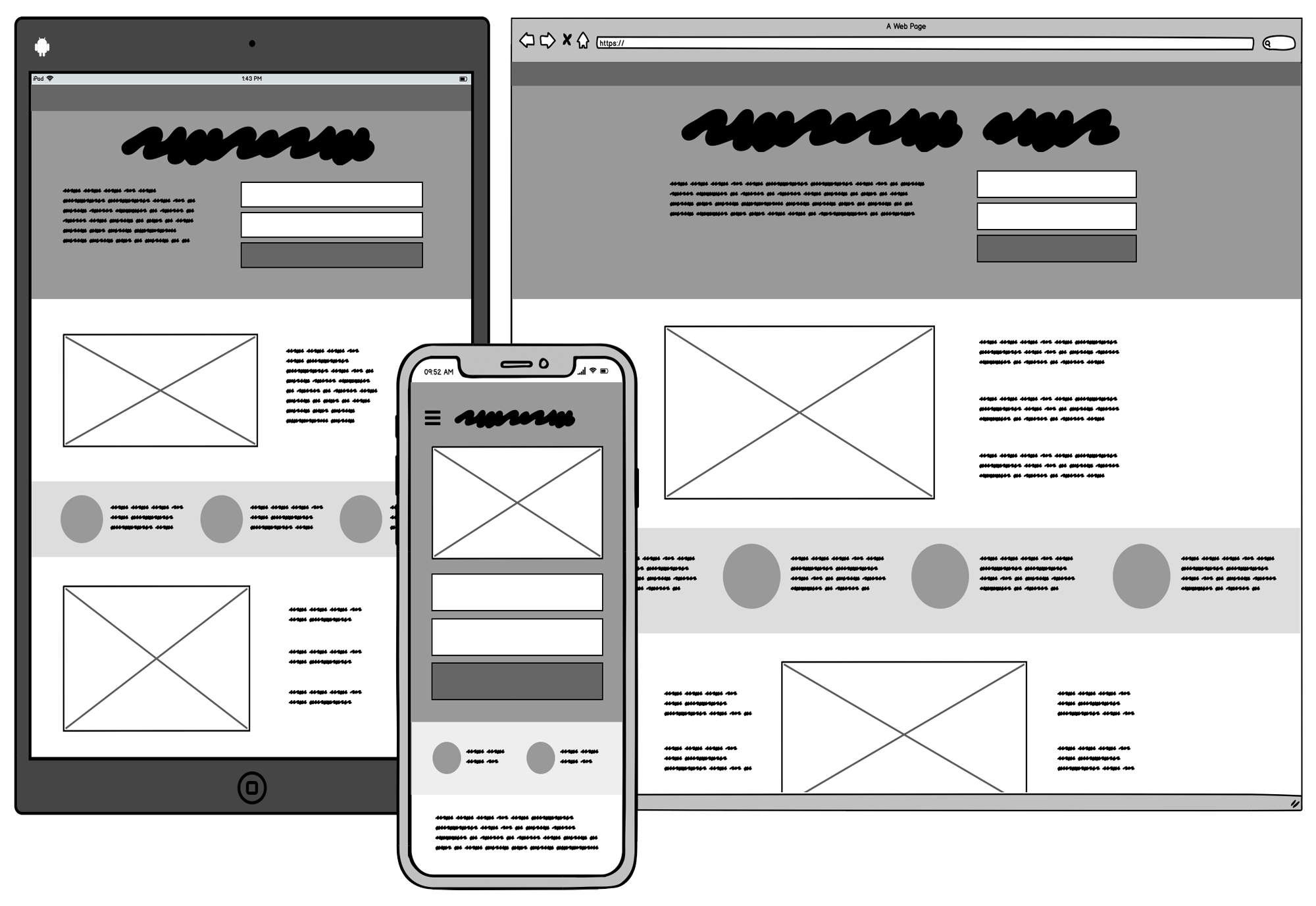
Wireframes are basic, low-fidelity visual representations of a design that outline the structure and layout of a digital product or service. A wireframe creates a blueprint for a digital product, such as a website, web app, or software. They outline each screen with basic lines and shapes, explaining functionality for businesses of all sizes. Designers can create wireframes using pen and paper (paper wireframe) or digital wireframe tools.
Wireframes are basic designs that are used as a foundation for creating a digital product. They are typically black and white and use simple shapes and text to show what the product will look like. They can be created using paper, a whiteboard, or a digital tool. They are used to agreeing on the core features of a product, and feedback should focus on usability rather than visual details like color or logos.
Types of Wireframes
There are several types of wireframes that can be used in the design process, each with varying levels of detail and fidelity. These include:
- Sketch wireframes: These are the simplest type of wireframes, created using a pencil or pen on paper. They are quick and easy to produce and are useful for brainstorming and ideation.
- Digital wireframes: These are wireframes created using digital tools such as Sketch, Figma, or Adobe XD. They can be more detailed than sketch wireframes and allow for easier collaboration and sharing with team members.
- Interactive wireframes: These wireframes are designed to simulate user interactions with the product. They may include click/tap interactions, buttons, and links to demonstrate how the product will work.
Examples of wireframes include paper sketches, whiteboard drawings, or digital wireframes created using tools like Sketch, Figma, or Adobe XD. Wireframes are an essential part of the design process and help ensure that the final product meets the needs of its users.
Purpose of Wireframes in UX Design
Using a minimalistic structural design to frame your design concept enables quick adjustments and gives an idea of how the future design will look. Wireframe annotations provide an opportunity to share ideas about complex design elements such as colors, shading, or intricate menus.
Wireframes serve several use cases, including:
- Communicating Structure: Wireframes share information architecture about the product's design, helping stakeholders understand the layout and flow.
- Quick Design: Wireframes provide quick design details, are simple, and are easy to modify, allowing for rapid iteration and feedback.
- Product Discovery: Wireframes aid in identifying business requirements, defining the scope of the product, and exploring potential solutions.
Before committing significant resources to build a UX & UI project, the team must align on what they're building. Wireframes help ensure everyone understands the goals and objectives of the project before writing any code or allocating resources. Wireframes are a valuable tool for businesses of all sizes in creating successful digital products.
Also, read - The Psychological Impact of UI/UX
What is Prototype & Its Importance in User Interface Design?
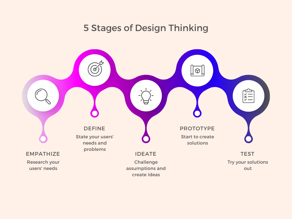
After creating a wireframe, the next step in the product design process is to create a prototype, which is a working model of an app or webpage. Prototyping enables designers to test the user journey, identify potential issues with interaction flow, and evaluate how users move between different tasks to achieve desired outcomes.
Types of Prototyping
Prototypes can be low-fidelity or high-fidelity:
- Low-fidelity prototyping: These prototypes are basic and quick to create, providing a rough idea of the design concept. Low-fidelity prototypes can be created using paper and pencil, or simple digital tools such as wireframing software. These prototypes are used to test out the basic layout, structure, and functionality of the design.
- Medium-fidelity prototyping: These prototypes provide a more detailed representation of the design concept, with increased functionality and more refined visual elements. Medium-fidelity prototypes can be created using digital prototyping tools such as InVision, Marvel, or Axure. These prototypes are used to test out the user experience and interaction design of the product.
- High-fidelity prototyping: These prototypes provide a highly detailed and realistic representation of the final product, with advanced functionality and polished visual elements. High-fidelity prototypes can be created using graphic design software such as Adobe Photoshop or Illustrator. These prototypes are used to test out the final look and feel of the product and are often used for client presentations or investor pitches.
Examples of prototypes include clickable website mockups, interactive app designs, physical product models, and even storyboard animations. These prototypes allow designers to test functionality, gather feedback, and refine their product before the final release.
When to Use the Prototype Model?
Prototyping plays a crucial role in the design process by serving multiple purposes, such as:
- Conducting usability tests: Prototypes enable you to put a functional version of your product in the hands of users, allowing you to verify the design's usability testing before releasing it.
- Validating ideas: Using prototype designs, you can share your ideas at an early stage of the design process, facilitating collaboration with your team to clarify your objectives.
- Facilitating collaborative designs: Prototyping allows you to involve multiple stakeholders, including UX writers, developers, and product managers, in testing the design, and validating navigation, functionality, and user flows.
- Attracting investors and updating stakeholders: In some cases, you may need to create a prototype to demonstrate to stakeholders that your idea has potential and is worth pursuing further.
What is Mockup in Web Design?
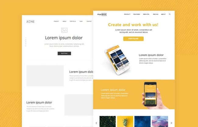
Mockup refers to a preliminary model of a design or product used for demonstration and feedback purposes. A mockup can be a static or interactive representation of the design and helps stakeholders to visualize and evaluate the final product.
Types of Mockups
There are different types of mockups that designers use based on their needs. These include:
- Wireframe Mockup: It is a basic representation of a design, which shows the structure and layout of the product. Wireframe mockups are typically used to create a rough draft of the design and determine its functionality.
- Visual Mockup: This type of mockup includes visual elements such as colors, typography, and images. Visual mockups help to define the visual identity of the product and its brand.
- Functional Mockup: These mockups are interactive and include functional elements such as clickable buttons, dropdowns, and sliders. Functional mockups allow users to experience the product and provide feedback on the user experience.
When To Use a Design Mockup?
Once the concept of mockups is clear, exploring their versatility becomes possible.
- Product discovery: Prior to initiating a project, mockups allow you to experiment with various approaches for your product.
- Ensuring stakeholder alignment: Several individuals contribute to designing and constructing a product, making alignment crucial throughout the process. Mockups can facilitate agreement on the final product and impress potential investors.
- Final design step: The product development cycle relies on designing a mockup, often as part of the design phase.
Irrespective of their usage, mockups function as valuable communication tools, conveying the final product's appearance. These tools are essential in any designer's arsenal, as effective communication is always preferable.
Are Prototypes Wireframes and Mockups the Same?
Although the terms "prototype," "wireframe," and "mockup" are often used interchangeably, each one serves a different purpose in the product development process. It's important to understand the differences between these terms to determine which one is suitable for a particular project.
Wireframes, prototypes, and mockups all share the goal of facilitating communication between stakeholders and helping to clarify design decisions. However, they differ in their level of fidelity, functionality, and the purpose they serve in the product development process.
Wireframes communicate a product's structure from a low-fidelity point of view, mockups highlight a product's design from a high-fidelity point of view, and prototypes focus on a product's functionality along with the design. While all three are important in the product design & development process, it's crucial to choose the right one for a specific project to ensure that the end product meets the desired objectives.
| Category | Wireframe | Prototype | Mockup |
| Purpose | To depict the basic layout and functionality of a design UX project. | To create a functional representation of the design, which can be tested by users. | To provide an impression of the final product's appearance and user experience. |
| Fidelity | Low-level fidelity | High-level fidelity | High-level fidelity |
| Functionality | No functionality | Lmitied functionality | Full functionality |
| Target Audience | Designers and developers | Designers, developers, and stakeholders | Stakeholders and clients |
| Timeframe | Early stage of design | Mid stage of design | Final stage of design |
| Tools | Pen and paper, digital wireframing tools | Digital prototyping tools | Graphic design software |
| Change | Easy to modify | Modifiable, but with effort | Difficult to modify |
| Cost | Low cost | Medium cost | High cost |
Wireframes, Prototypes, and Mockups Use Cases
When engaging in software product design, it is imperative to gain a comprehensive understanding of the project's scope, purpose, functionality, and process. Wireframes, mockups, and prototypes are essential components of the design process, with each having its own distinct use cases that can prove advantageous during different stages of the development process.
Wireframes Use Case
Wireframes, in particular, play a crucial role in user experience design, as they enable designers to concentrate on the fundamental elements of a product, including its layout and functionality without getting bogged down in details like color or typography. By using wireframes, designers can quickly recognize potential usability challenges, resulting in significant savings in time and effort in the long run.
For example, when designing an e-commerce website, a wireframe can help designers determine the best placement of essential elements such as product listings, filtering options, and the shopping cart. Wireframes can also help designers to experiment with different user flows and navigation options, ensuring a smooth and intuitive experience for users.
Prototypes Use Case
Prototypes are interactive models of a product that facilitate designers and developers to test and refine its functionality. Developing a prototype identifies the detection and addresses the related issues in the early stages of the development process, reducing the risk of costly UI UX Design Mistakes later on. Prototyping is especially advantageous when creating intricate software products, such as mobile apps or web applications.
For example, suppose you are creating a mobile app for a fitness enterprise. In that case, by designing a prototype, you can assess the user experience of registering and booking a workout session, guaranteeing that the procedure is straightforward and user-friendly. Prototyping also enables the collation of user feedback, streamlining the process of perfecting and enhancing the product before its launch.
Mockups Use Case
Mockups are high-fidelity designs that represent the ultimate product's appearance in high detail. They are particularly beneficial when communicating with stakeholders, such as investors or clients, as they provide a more genuine representation of the final product. By presenting a mockup, you can assist stakeholders in comprehending how the product will work and how it will fulfill their needs.
For example, if you're designing a new website for a client. In that case, you can present a mockup to showcase how the website will look, incorporating the color scheme, typography, and layout. This approach will give the client an accurate idea of what to anticipate and make it simpler for them to provide constructive feedback on the design.
The process of design involves a variety of indispensable tools, such as wireframes, prototypes, and mockups, each with its own specific applications.
When employed, these tools can help enhance the quality of products, reduce the expenses associated with development, and streamline communication between stakeholders.
By understanding the unique features of each tool, designers and developers can leverage the most suitable option at each phase of the design process, leading to the achievement of their project goals.
Tools Used For Wireframe vs. Mockup vs. Prototype
Tools used for wireframe, mockup, and prototype creation differ based on the level of detail and functionality required for each stage of the design process.
- Wireframe: In the initial stages of design, designers use low-fidelity wireframes that depict the basic structure and layout of the design. These wireframes can be created using pen and paper or digital wireframing tools such as Adobe XD, Figma, or Sketch.
- Mockup: During the final stages of design, designers create high-fidelity mockups that represent the final look and feel of the design concept. Designers use graphic design software such as Adobe Photoshop or Illustrator to create mockups that showcase the color scheme, typography, and other visual elements of the design.
- Prototype: In the mid-stages of design, designers create interactive prototypes that provide a medium level of detail and limited or no functionality to demonstrate the design concept. Prototypes can be created using digital prototyping tools such as InVision, Figma, Marvel, or Axure.
Each tool serves a specific purpose in the design process and helps designers communicate their design ideas effectively to stakeholders, developers, and clients. By using the appropriate tools for each stage of the design process, designers can ensure that their final product meets the needs and expectations of their target audience.
Wireframes, prototypes, and mockups are essential tools in the design process that help businesses create products that are visually appealing, functional, and user-friendly. These tools are instrumental in effective communication, collaboration, and cost savings, all contributing to a successful product launch and customer satisfaction.
Final Words
Wireframes, prototypes, and mockups each play a unique role in the design process. Wireframes allow designers to create a basic structure and layout of a product, prototypes provide a medium level of detail and limited functionality to demonstrate the design concept, and mockups showcase the final look and feel of the product.
These design tools are crucial for businesses to create products that are visually appealing, functional, and user-friendly. By using the appropriate tool for each stage of the design process, businesses can communicate their design ideas effectively and collaborate with stakeholders, designers, and developers to ensure a successful product launch.
At RedBlink, we specialize in providing top-notch web design services to businesses looking to create exceptional products. Our team of skilled designers uses wireframes, prototypes, and mockups to create products that meet the needs and expectations of our client's target audience. We are committed to providing a design experience that results in customer satisfaction and loyalty. Contact us today to learn how we can help bring your design ideas to life!
Also please check out our Portfolio to see the exceptional projects we have delivered. Our portfolio showcases our expertise in UI/UX design, wireframes, prototypes, and mockups. By browsing our portfolio, you will get a glimpse of the high-quality solutions we provide to our clients.
Resources -
-
- Prototyping: Paper Versus Digital by Jim Ross
- High-Fidelity or Low-Fidelity, Paper or Computer Choosing Attributes When Testing Web Prototypes by James Landay
- Designing Interactive Systems: People, Activities, Contexts, Technologies by David Benyon
- Measuring the User Experience, Second Edition: Collecting, Analyzing, and Presenting Usability Metrics
- Designing for the Digital Age - How to Create Human-Centered Products and Services by Kim Goodwin
25+ Best Figma Plugins for Designers in 2024 [ Free & Paid ]
Best Figma Plugins for Web Design
Figma, an interface and design application accessible via a browser, presents a multi-faceted solution for designing and prototyping. Its utility extends beyond the design realm as it has the ability to generate code for your application. Currently, it dominates the interface design landscape due to its comprehensive features that cater to teams at every stage of the web design process.
Comparing it to Adobe XD or Sketch, Figma demonstrates numerous advantages. For instance, it works online and enables real-time collaboration with others.
Additionally, Figma boasts great functionality, a sleek UI, and the recent launch of Figma plugins. These plugins offer many functions and processes that facilitate project design and launch, rendering them as effortless as plug-and-play.
People Also Ask
Can Figma be used for UI UX design?
Yes, Figma is a popular design tool used for UI/UX design. It provides a range of design features and collaboration capabilities that allow designers to create effective user interfaces and user experiences.
Is Figma enough for a UX designer?
Figma can be enough for a UX designer, depending on the specific project requirements and the designer's individual preferences. Figma provides a range of design features and collaboration capabilities that make it a popular choice for UX designers. However, some designers may choose to use additional tools or software for specific tasks.
What do UX designers use Figma for?
UX designers use Figma for a range of tasks, including creating wireframes, designing user interfaces, prototyping, and collaborating with team members. Figma's intuitive design features and real-time collaboration capabilities make it a popular choice for UX designers looking to streamline their workflow.
Which is the best tool for UI UX design?
There is no one-size-fits-all answer to this question, as the "best" tool for UI/UX design depends on individual preferences and project requirements. However, some popular tools for UI/UX design include Figma, Sketch, Adobe XD, InVision Studio, and Axure. Each of these tools offers unique features and benefits, so it's important to evaluate them based on your specific needs.
Top Figma Plugins That Every Designer Must Have
The world of Figma plugins is constantly expanding with new ones popping up every day. These plugins cater to specific user groups and cover a wide range of niches. In this article, we will delve into the list of the best Figma plugins for web design.
So without any ado, let's dive into the list of Best Figma Plugins for UX UI Designers in 2024[ Free & Paid ]
1. Unsplash

When it comes to design, visuals are paramount. They have the power to elevate the appearance of your interface, catch the users' attention, and provide context to your content. However, finding the perfect images for your design can be a tedious task that requires a lot of time and effort. This is where the Unsplash plugin comes in handy.
The Unsplash plugin is a stock photo gallery that provides royalty-free images that you can use to enhance your web design. You can access it without leaving your screen, saving you time and effort. The plugin is easy to use, and all you have to do is select the shape where you want to include an image and search for the desired image on Unsplash. You can even specify a keyword to narrow down your search results.
Features:
- High-quality images
- Large image library
- User-contributed photos
- API access for developers
- Available in different sizes
- Easy-to-navigate website
Price: Free
Click here to Download the Unsplash Plugin
2. Autoflow
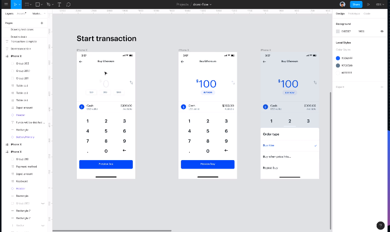
Autoflow is a Figma plugin that simplifies the process of creating connection arrows between frames. It can automatically draw flow arrows in Figma and illustrate user flows, diagrams, or graphics in a hand-drawn or minimalist style.
With Autoflow, you can draw shapes and connect them to quickly establish user flow. If you move frames, the arrows automatically adjust to maintain their connection. No need to manually edit any arrows - Autoflow does the work for you.
Features:
- Intelligent obstacle detection
- Text annotations on the path
- Custom path routing
- Auto-update on moving
- Offset start/end terminal spacing
- Multiple terminal styles
- Pause drawing mode so you can keep the plugin open while working
Price: Free for up to 50 flows per file and can get individual lifetime access to Autoflow for a one-time fee of $49.
Click here to Download the Autoflow Plugin
3. Figmotion
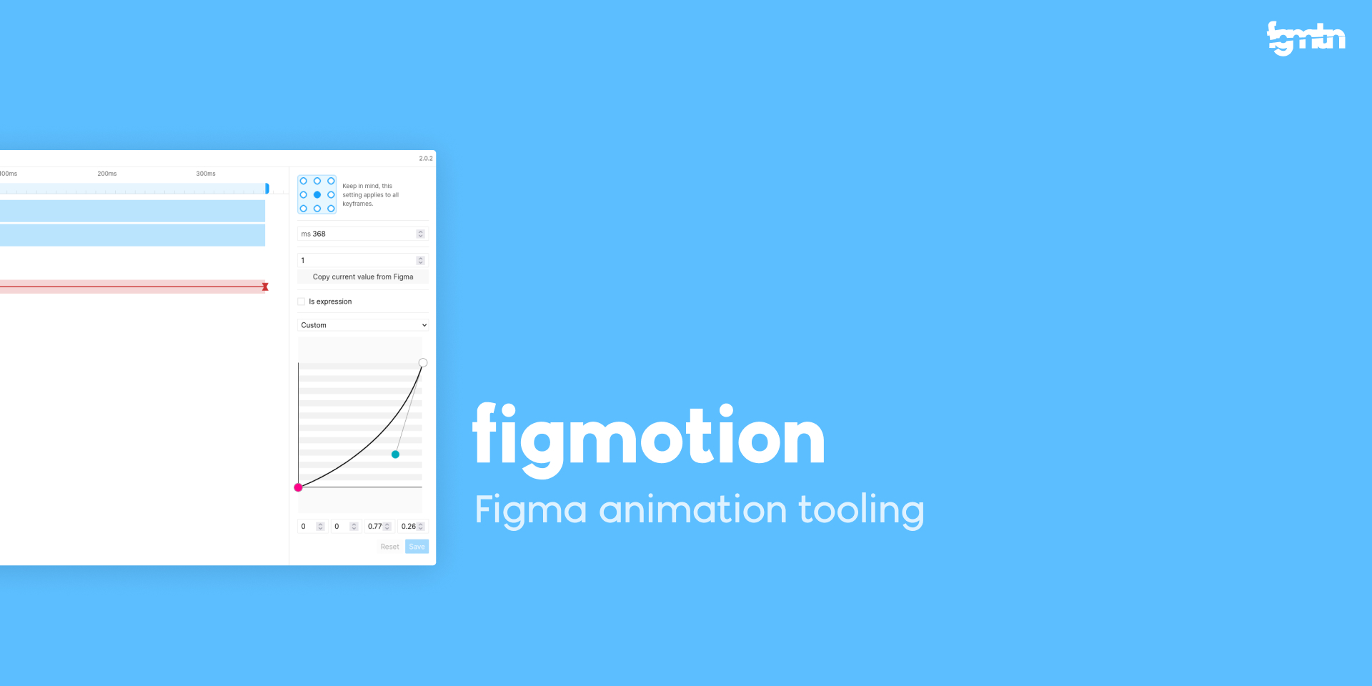
Figma Motion is an animation tool that is incorporated within Figma. In this way, a person can easily transition into animation without learning a separate motion tool such as Principle, Haiku, or After Effects. In addition, Figmotion makes animation hand-off to developers easier and is built with web technologies in mind.
Features:
- Separate UI for Figma
- Animating with expressions
- Export to Lottie
- Render animations
Price: Free
Click here to Download the Figmotion Plugin
4. Remove BG

If you're tired of struggling with Photoshop's complicated tools to remove backgrounds from your images, then here's some good news. You can now integrate remove BG with Figma, which allows you to automatically delete image backgrounds whenever you're designing website wireframes, mobile app interfaces, prototype designs, social media posts, and more.
Features:
- Background removal
- AI-powered
- High-quality output
- Quick and easy
- No manual work
- Supports multiple file formats
- Batch processing
- Secure and private
- User-friendly interface
- Affordable pricing options
- 24/7 customer support
Price: Plans Both free and paid. The monthly subscription plan starts from ₹ 13.25/image and the one-time payment is ₹ 59.90/image.
Click here to Download the Remove BG Plugin
5. Color Contrast Checker
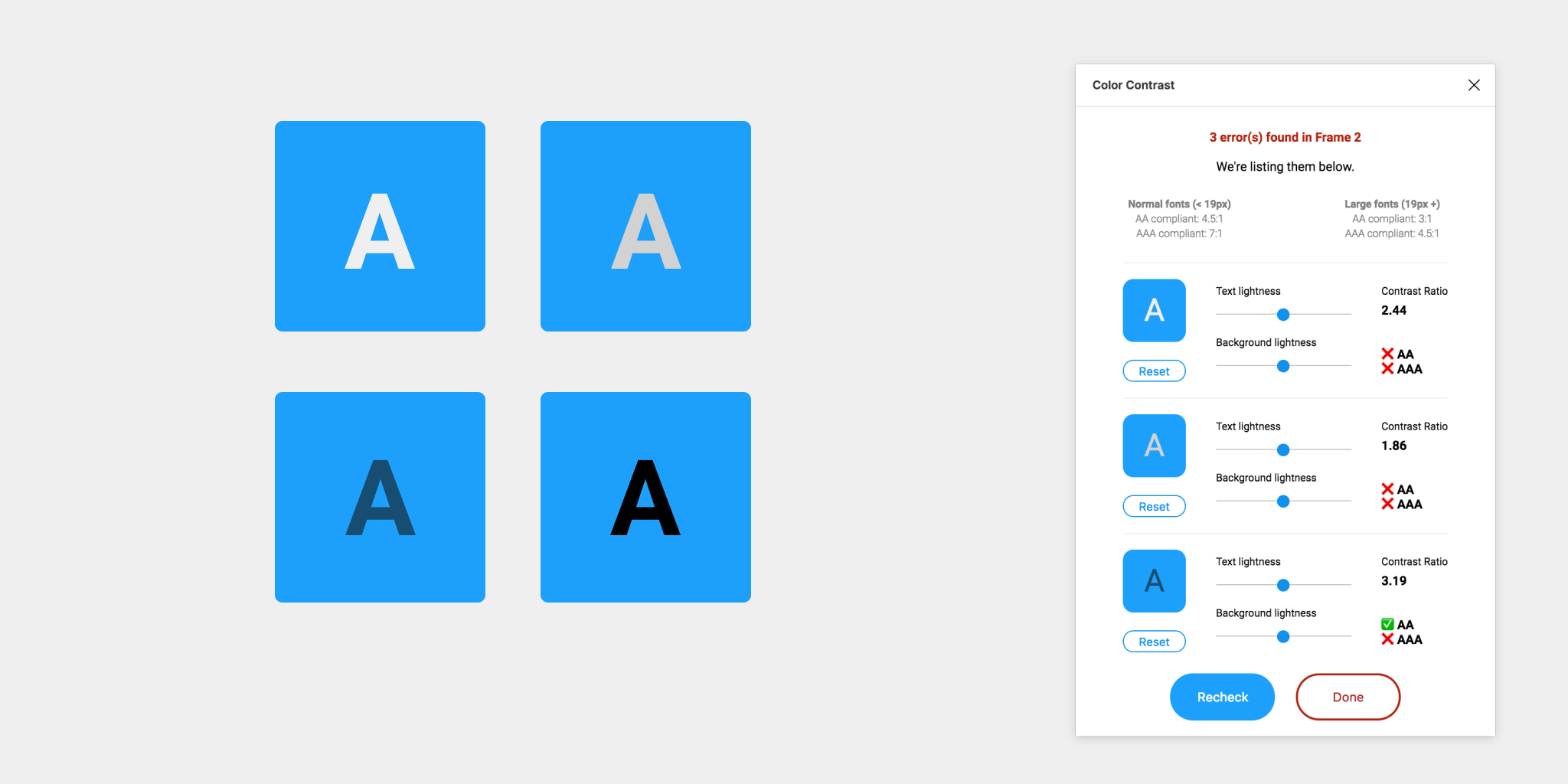
This plugin checks the color contrast ratio for all the text that you can see in a frame, and it lets you know whether it meets WCAG's AA and/or AAA compliance levels. It even has color sliders that let you adjust the colors and see how the contrast ratio changes in real time.
However, there are some issues with the plugin. It can only support a single solid fill at 100%. There are also problems with detecting the background layer, but the developers are already working on fixing these issues.
Features:
- Contrast ratio analysis
- WCAG compliance
- Color sliders
- Real-time feedback
- Single fill support
- Background layer detection
Price: Free
Click here to Download the Color Contrast Checker Plugin
6. Wireframe
Wireframe plugin is a great Figma tool for making visually appealing wireframes, user flows, prototypes, and basic structures. It's very easy to use, as you only need to drag and drop it onto your Figma project.
All the wireframe elements are available for free under a Creative Commons license, and since they're SVG files, they're easily editable. With this plugin, you can manage all your wireframing and prototyping activities as per your requirements.
Features:
- User-friendly interface
- Drag and drop
- Creative Commons license
- SVG files
- Easy editing
- Free elements
- Prototyping capabilities
- Basic structures
- User flow
- Visually appealing
- Efficient wireframing
Price: Free
Click here to Download the Wireframe Plugin
7. Iconify
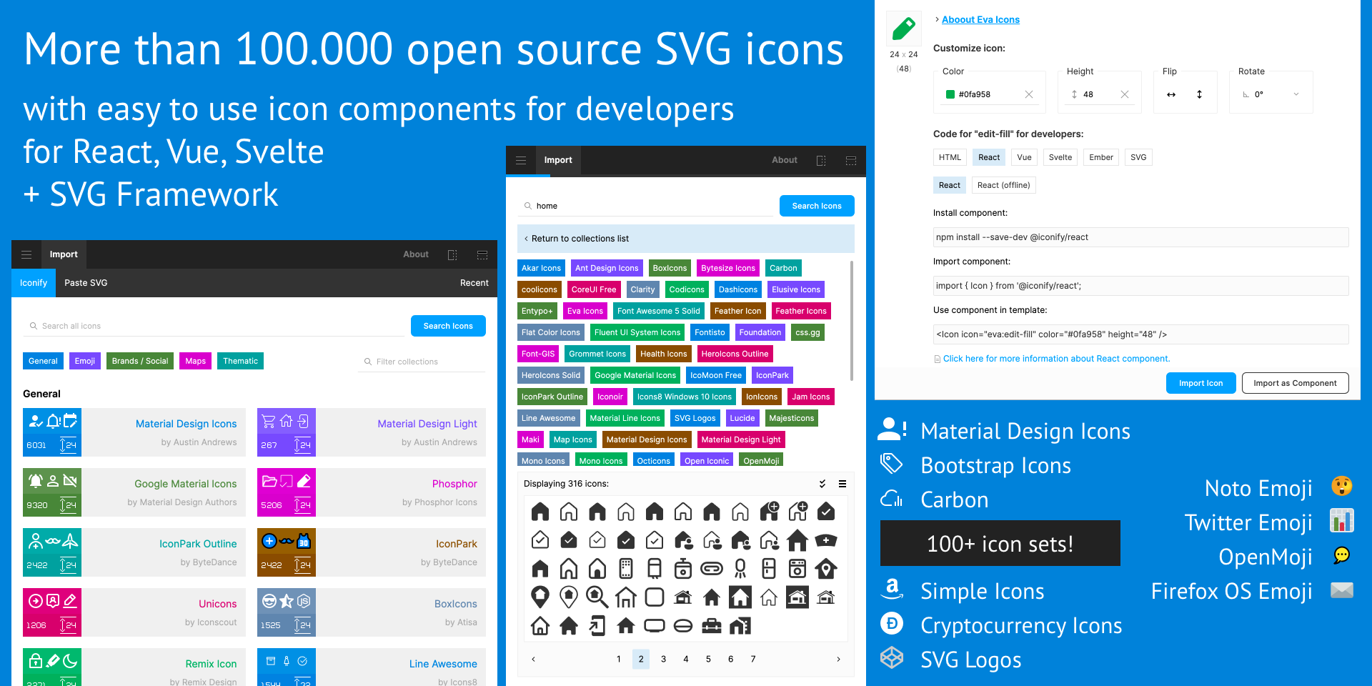
Iconify is a library of icons in Figma plugins. It has over 100 icon sets with more than 100,000 icons that can be imported as vector shapes to Figma documents. Here are some features of Iconify:
Features:
- Extensive icon library
- Easy import
- Vector shapes
- Customizable
- Search function
- Categorized sets
- Constant updates
- Compatibility with Figma plugins
- User-friendly interface
Price: Free
Click here to Download the Iconify Plugin
8. Content Reel

Content Reel is a helpful plugin that allows you to fill your layout with various types of text data, including first and last names, avatars, phone numbers, nicknames, addresses, email addresses, company names, and countries. All the data is flexible, making it easy to customize to your needs. This tool is handy when adding random data to your design quickly.
Features:
- Flexible data options
- User-friendly
- Time-saving
- Customizable
- Random data
- Useful plugin
Price: Free
Click here to Download the Content Reel Plugin
9. Batch Styler
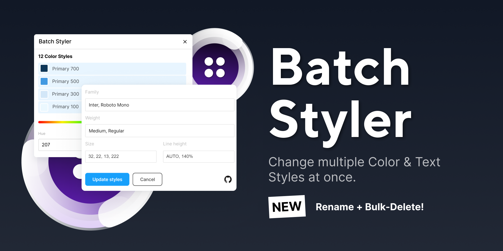
Batch Styler is a tool that allows you to change multiple text and color styles at once. It simplifies the process of changing values of various text styles by doing it in one go. Whether it's two or thirty text styles, you can change from Inter to Roboto while maintaining all font weights and other style features. With Batch Styler, updating colors that share the same hue value is also effortless, as it will update all styles accordingly.
Features:
- Change color styles (hue, saturation, lightness, alpha, hex)
- Change typography styles (font family, font weight, line height, letter spacing)
- Delete styles
- Rename styles
- Description(s)
Price: Free
Click here to Download the Batch Styler Plugin
10. Zeplin
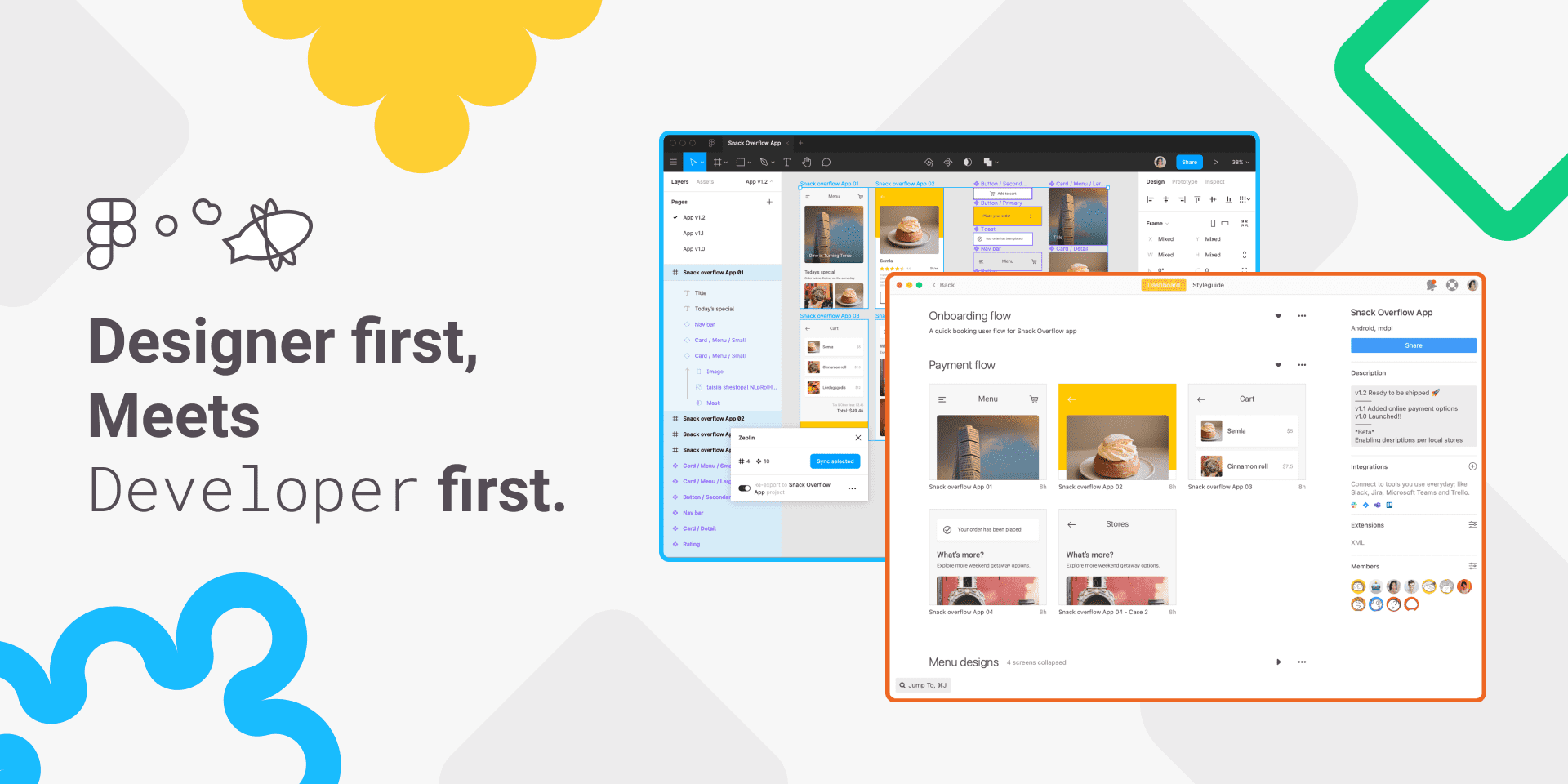
If you're a designer who works with a team of developers, you'll definitely want to check out the Zeplin plugin. It helps you collaborate more efficiently by providing an organized workspace where you can share your designs with the entire team, while still allowing you to work in Figma.
You can publish your designs easily on Zeplin and developers will have a clear understanding of what to build. Additionally, you can connect components to code and scale your design system into the developer world.
Features:
- Streamlined design collaboration
- Efficient workflow between designers and developers
- Easy publishing of designs on Zeplin
- Organized workspace
- Efficient collaboration
- Clear communication
- Component linking
- Design system scaling
Price:
- Free Plan: It is free for up to 6 Project Members.
- Team Plan: For small teams - $8 seat/month - 12 Projects
- Organization Plan: For medium to large teams - $16 seat/month - 12 seat minimum - 12 to unlimited projects
Click here to Download the Zeplin Plugin
11. Chart
Chart is a Figma plugin that helps generate commonly used charts with real or random data. It allows for easy copying and pasting of data from Excel, Numbers, and Google Sheets and lives connections with Google Sheets and remote JSON files. Chart also supports local CSV and JSON files.
Features:
- Provide 18 pre-built chart types for immediate use.
- Create multiple chart instances for versatile usage.
- Facilitate the production of random data with diverse trends.
- Import data from various sources, such as CSV, JSON, Google Sheets, and REST APIs, or type it into a table input or paste it from table processors like Excel.
- Customize with several options to suit specific needs.
- Enable users to update charts as needed for ongoing improvements.
Price:
- Free: $0/year - 2 chart types, style templates, and editing and updating
- Pro: $20/year - 16 chart types, style templates, and editing and updating
- Team: $10/month - All in PRO, plus shared templates, and unlimited users
Click here to Download the Chart Plugin
12. Lottiefiles

Looking to add some excitement to your product? LottieFiles has got you covered! You can choose from a wide range of cool animations, customize them with your brand colors, adjust the speed, and save them as either GIFs or JSON files. And if you use Figma, you're in luck! With the LottieFiles plugin, you can browse and import files directly within Figma, making adding some pizzazz to your designs easier than ever.
Features:
- Upload your personalized dotLottie (.lottie) and Lottie JSON (.json) files through drag-and-drop.
- Choose from a vast library of 1000s of Lottie animations for free.
- Preview all your animations from within LottieFiles.
- Enhance your designs by inserting high-quality SVGs as animation frames.
- Add dynamic Lotties as GIF animations.
- Transform static SVGs into captivating Lottie animations.
Price: Free
Click here to Download the Lottiefiles Plugin
13. Stark
Gone are the days of endlessly laboring over the creation and testing of accessible software. Whether you're designing a website, online store, mobile application, or SaaS product, Stark empowers every designer, engineer, project manager, and QA expert to effectively and efficiently make their work accessible.
With a comprehensive array of features, including Contrast Checker, Focus Order, Alt-Text Annotations, Vision Simulator, and much more, all accessible in a single location, identifying accessibility problems in a design before it goes into production or rectifying those already in flight has never been simpler.
Features:
- Contrast Checker with Color Suggestions
- Vision Simulator
- Vision Generator
- Landmarks and Focus Order
- Alt-Text Annotations
- Typography Analysis
- Touch Targets
Price: There are three plans -
- Free: Access to a max of 3 projects
- Pro: $10/month- Unlimited projects
- Team: $15 / month
Click here to Download the Stark Plugin
15. Locofy
Locofy is a nifty plugin that operates on the Figma platform. Its main function is to translate your design files into production-ready code using AI. As a result, your team can expedite the product shipping process by 5-10x times its usual pace. With Locofy, designers can eliminate the need for static design files and instead provide pixel-perfect, highly extensible code that follows best practices. This means that maintenance is easier and requires less input from developers.
The plugin provides many customizable options, from generating CSS variables to creating components. It supports a variety of code exports, including React, Next.js, Gatsby, HTML-CSS, and React Native. Locofy builds on the properties of your design file for responsiveness and styling. This means that if your design is responsive on Figma, it will remain responsive on Locofy as well.
Features:
- Figma integration
- AI-powered code generation
- Pixel-perfect code
- Highly extensible
- Customizable options
- Multiple code exports
- Responsive design
- Easy maintenance
- Faster product shipping.
Price: Free
Click here to Download the Locofy Plugin
16. Color Blind
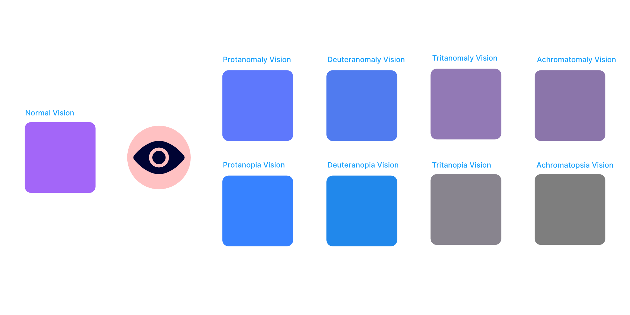
Color Blind is a plugin that lets you see your designs through the eyes of people with 8 different types of color vision deficiencies. It's easy to use - just select the option you want, and the plugin will create a copy of your design with colors adjusted to simulate the vision of someone with that particular type of color blindness. The plugin will label each copy with the corresponding type of color blindness, and group them together. Additionally, you can choose to view only specific types of color blindness by using the checkboxes in the plugin's user interface.
Features:
- Color vision simulation.
- Eight vision types.
- Easy to use.
- Color-coded labels.
- Checkbox options.
- No image support.
Price: Free
Click here to Download the Color Blind Plugin
17. Design Lint
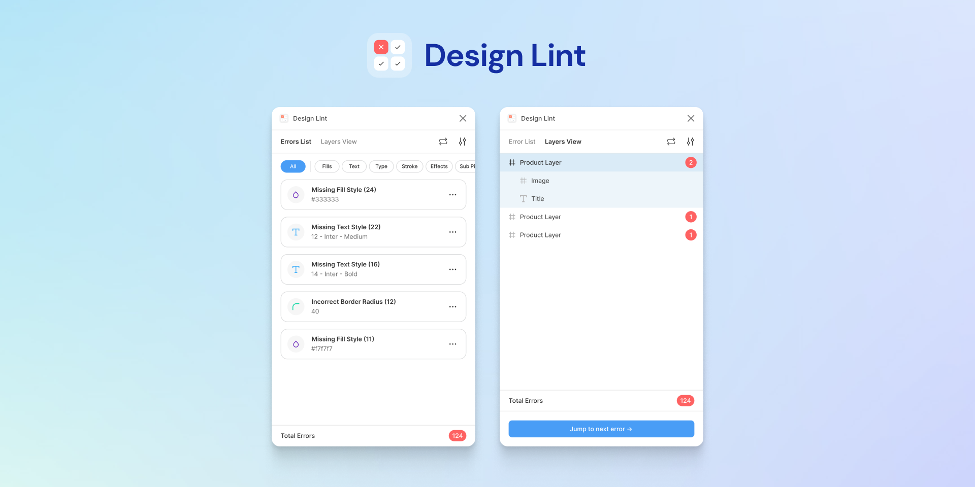
Design Lint is a tool that can help you identify any missing styles within your designs. It's an open-source plugin that can be very useful in ensuring that your designs are ready for development or collaboration with other designers. With Design Lint, you can fix inconsistencies and make sure that everything is up to par. You can simply use it to identify missing styles and fix them as needed.
While Design Lint is running, it will update automatically as you fix any errors that it finds. Additionally, clicking on a layer will also select that layer in your design. This makes it much easier to navigate between mistakes and fix them quickly, rather than having to hunt for them on your own.
Features:
- Open source plugin
- Identifies missing styles
- Fixes inconsistencies
- No account needed
- Auto-updates
- Layer selection
Price: Free
Click here to Download the Design Lint Plugin
18. Better Font Picker
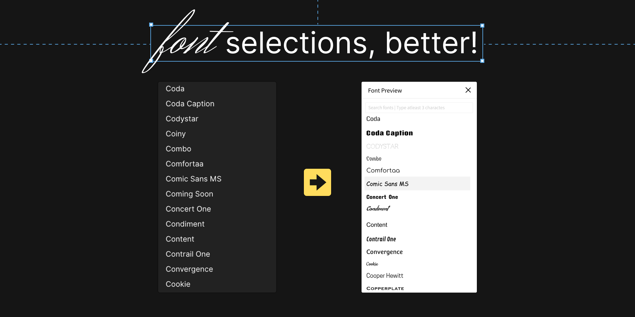
Better Font Picker is a tool that lets you choose fonts by showing you a preview of how they look. It's a great way to quickly go through all the fonts you have installed, and it's a great alternative to the default font picker in Figma.
Features:
- Font Previews
- Easy Navigation
- Quick Install
- Customizable Filters
- Type Pairing
- Search Functionality
- Collaborative Sharing
- User-Friendly Interface
- Multi-Language Support
- Accessibility Options
Price: Free
Click here to Download the Better Font Picker Plugin
19. FlyOver
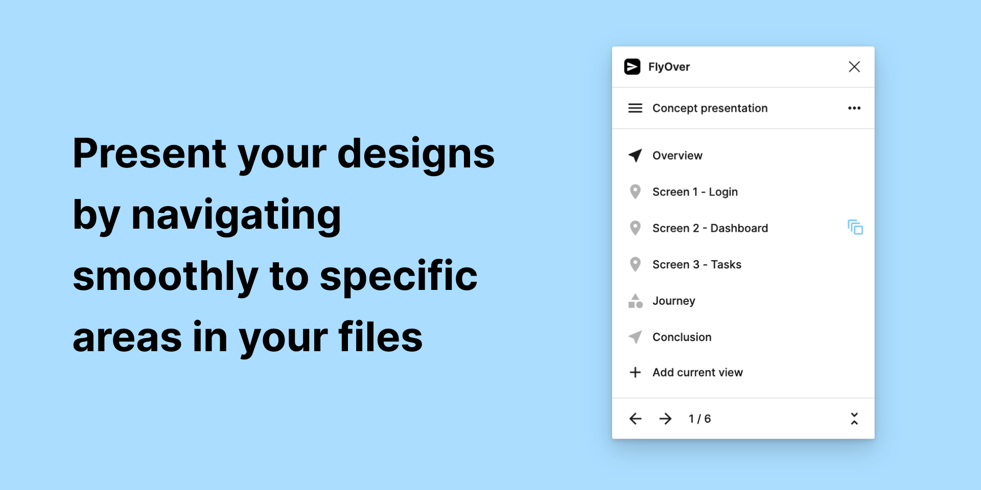
Flyover is a feature or tool that helps in navigating a canvas or a design layout more efficiently. It allows users to bookmark specific sections or frames of the canvas or design layout and easily navigate to them in a visually pleasing way. This tool can be helpful when presenting designs or sharing screens with others, as it eliminates the need for scrolling or searching for the desired section or frame.
Features:
- Bookmarking tool
- Efficient navigation
- Visual appeal
- Design layout assistance
- Screen sharing aid
- Eliminates scrolling
- Easy access to key sections/frames
- User-friendly interface.
Price:
- Free: 1 presentation with 30 views
- Pro: Unlimited presentations, Unlimited views, and Customize the animation speed, style, and ease for each view
Click here to Download the FlyOver Plugin
20. Instance Finder

To find a specific component used in your file, simply select it and the plugin will scan all pages and frames for all instances of that component. The resulting list will be organized by page for easy browsing and clicking on an item will zoom in on the instance.
Features:
- Component Search
- Page scanning
- Frame scanning
- Instance listing
- Easy navigation
- Zooming feature
Price: Free
Click here to Download the Instance Finder Plugin
21. Find and Replace
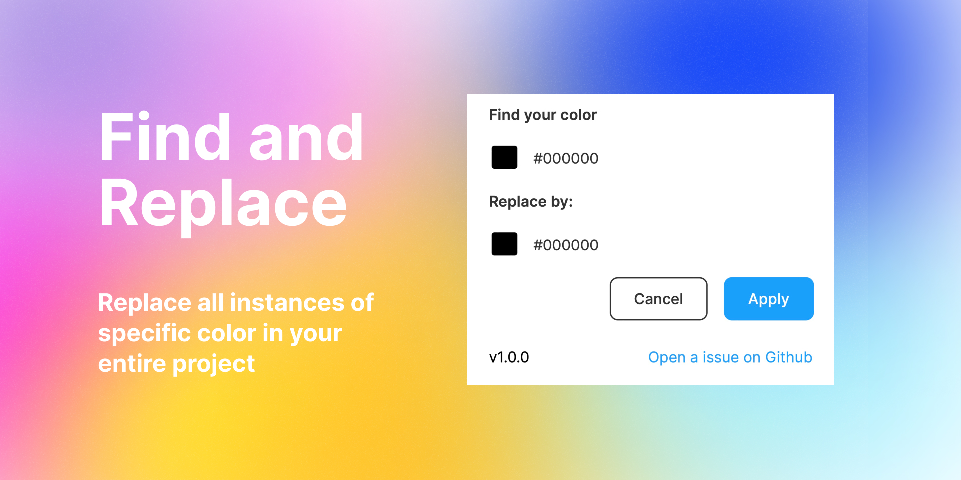
When you're editing your page, you can use the find and replace tool to quickly make changes to your text. This tool allows you to search for specific words or phrases and replace them with something else. You can also search for objects on your page by their name or content. To access this tool, look for the "find and replace" option in your editing software.
Features:
- Efficient Editing
- Targeted Revisions
- Time-Saving
- Customizable Settings
- Streamlined Workflow
- Accurate Modifications
- Global Changes
- Error-Free Revisions
- Text Transformation
- Improved Productivity
Price: Free
Click here to Download the Find and Replace Plugin
22. Downsize
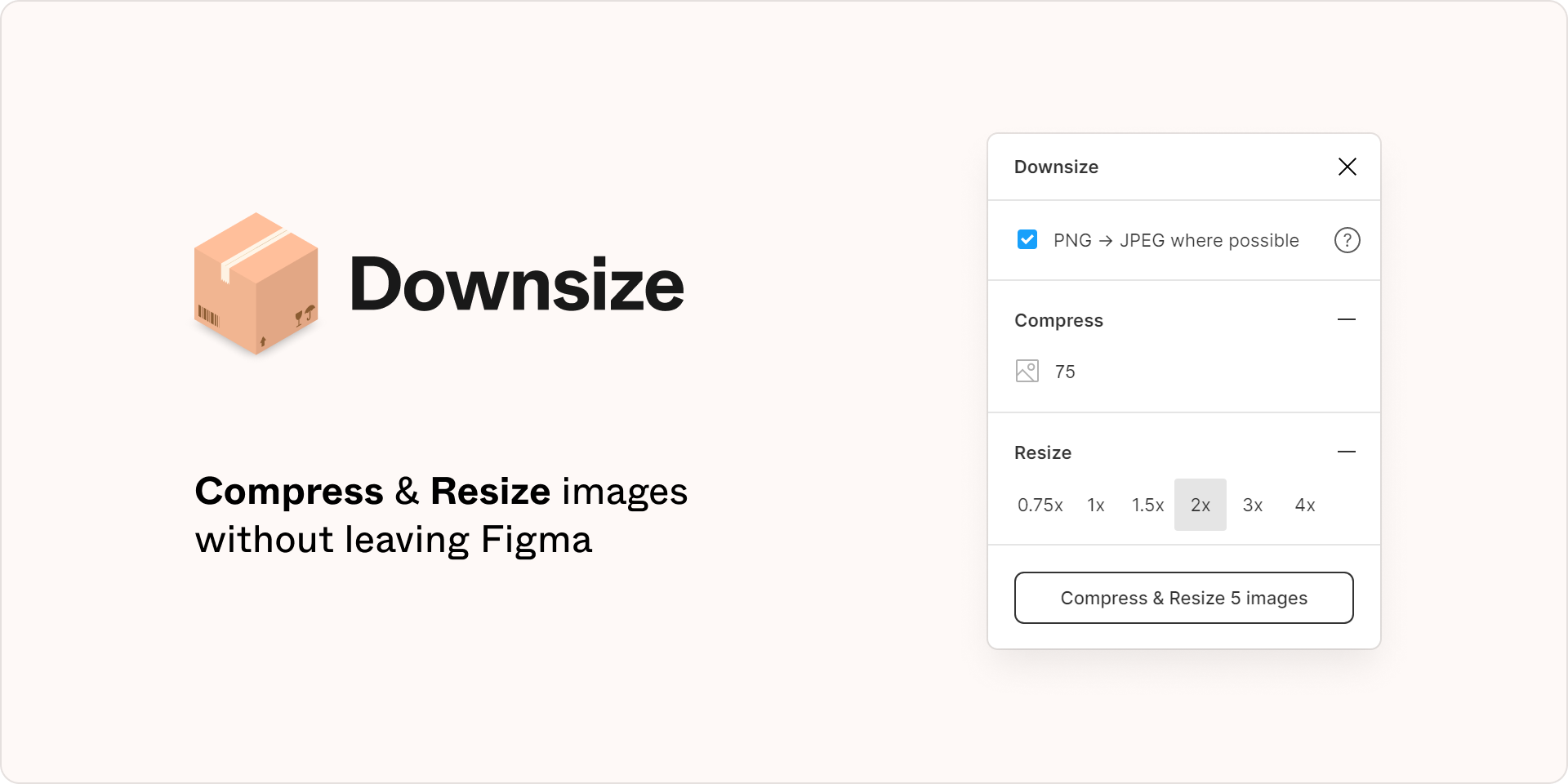
Downsize is a tool or software that is designed to compress images in a file without reducing their quality. This makes the file size smaller, which in turn makes it faster to work with and easier to share or transfer.
Features:
- Image compression
- No quality loss
- Batch processing
- User-friendly interface
- Customizable settings
- Faster file transfer
- Saves storage space
- Supports multiple file formats
Price: Free
Click here to Download the Downsize Plugin
23. Bibbble
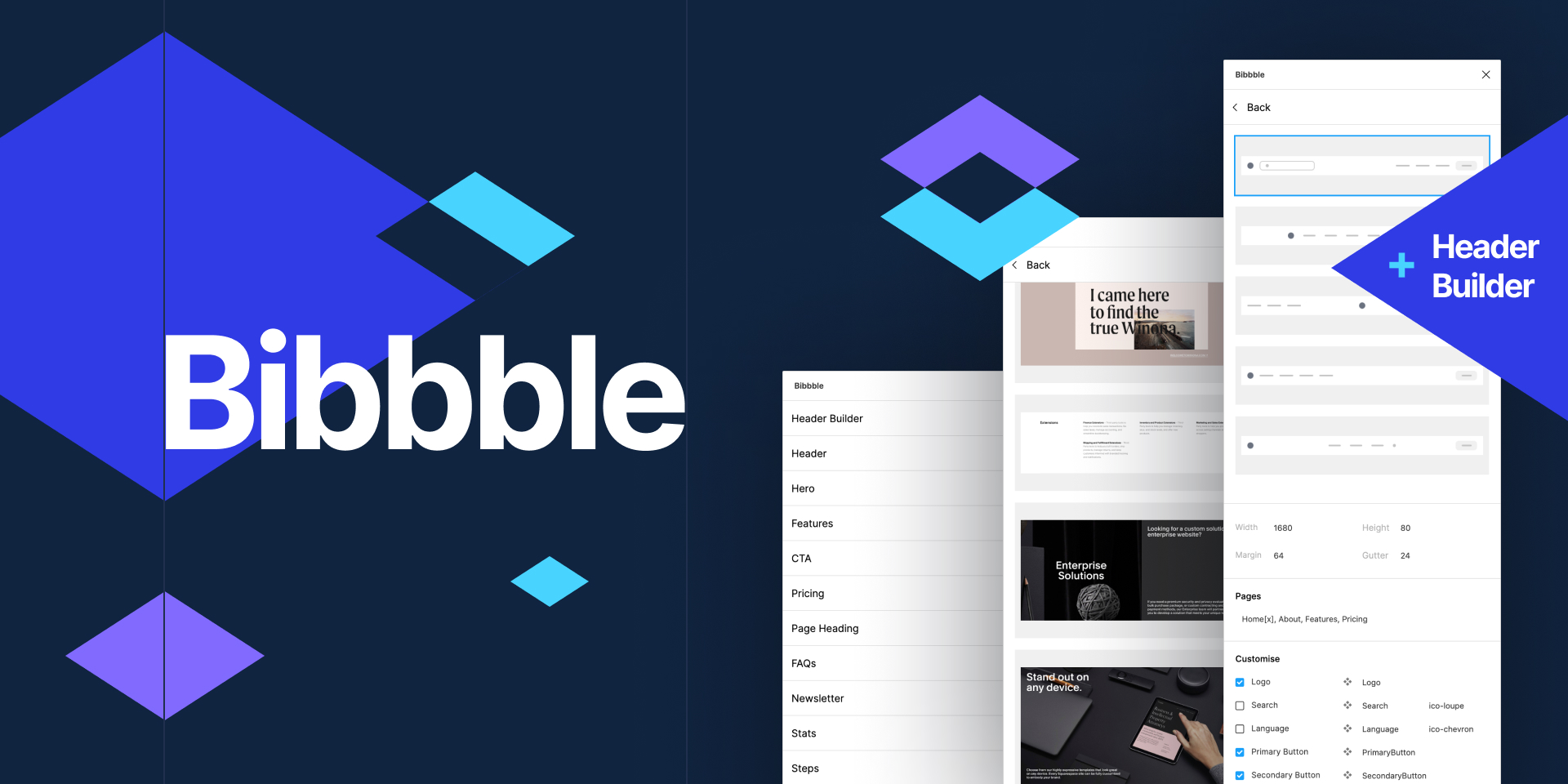
Bibble is a library of UX/UI screenshots that serve as a single source of truth. It contains carefully chosen solutions from the most popular websites.
Features:
- Discovering suitable layouts/UI & UX solutions for a project
- Gaining inspiration from industry leaders
- Importing high-quality screenshots quickly
- Searching for designs using specific keywords
- Acquiring authentic solutions from actual websites
Price: Free
Click here to Download the Bibbble Plugin
24. Storyset by Freepik
https://storyset.com/images/figma/video-figma.mp4
Freepik, a well-known source for free graphic resources, has recently launched a new product called Storyset. This product offers a vast collection of illustrated concepts that can be downloaded and customized to fit your needs. The best part is that they come in various styles and can even be animated using the online editor provided by Stories by Freepik. So, why not check it out and start creating?
With the Storyset plugin, you can easily search for illustrations from the Storyset database and directly insert them into your project. You have the freedom to choose the illustration's style, color scheme, and background in just a few clicks. It's a quick and hassle-free way to enhance your project with high-quality graphics.
Features:
- Free illustrations
- Editable colors
- Different styles available
- Animation capability
- Online editor
- Easy to use
- Searchable database
- Customizable backgrounds
Price: Free
Click here to Download the Storyset by Freepik Plugin
25. Feather Icons
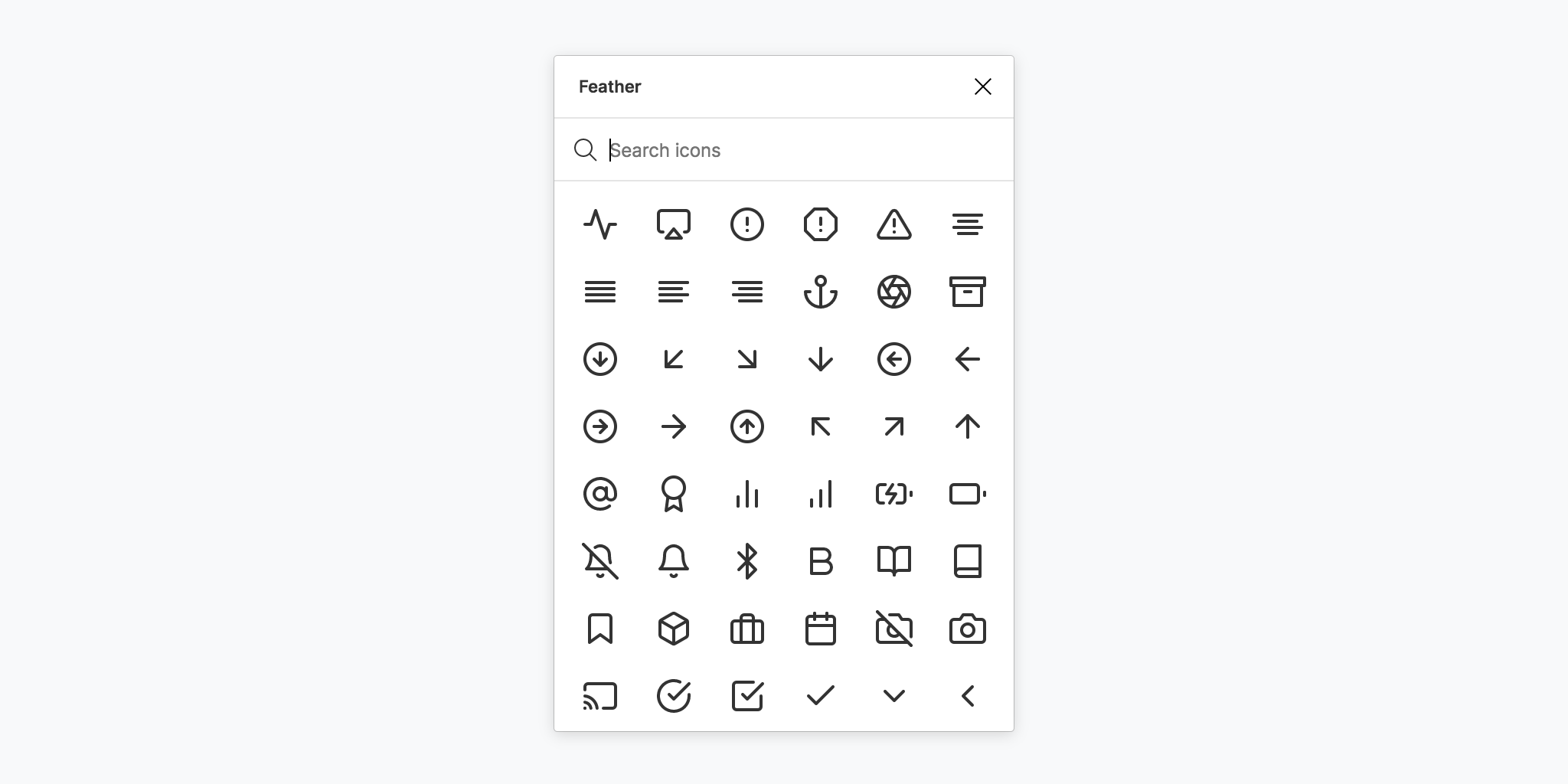
Feather icons are a set of font types that can be used in websites and applications. These icons are scalable vector graphics, which can be adjusted in terms of shadow, color, size, and other CSS properties. Developers and designers working on different platforms can download the growing collection of Feather icons and use them in accordance with their preferences.
Features:
- Scalable graphics
- Highly customizable
- CSS-compatible
- Growing collection
- Multi-platform usage
Price: Free
Click here to Download the Feather Icons Plugin
26. Vectary 3D
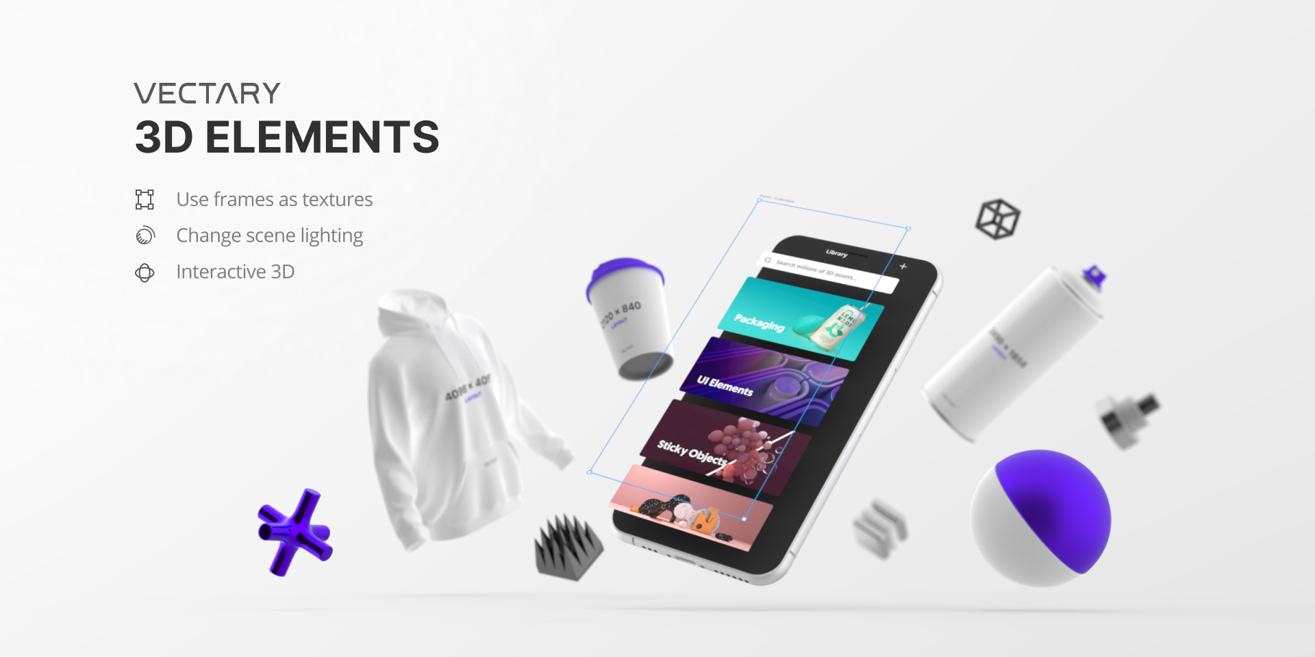
Vectary 3D plugin for Figma is a tool that allows you to add a third dimension to your 2D designs. You can easily insert your Figma design into a predefined 3D mockup or even create your own custom 3D element. By adjusting the perspective in 3D, you can achieve the desired effect and incorporate it seamlessly into your design with just one click.
Features:
- Free mockup library
- Customizable editor
- Edit textures/materials
- Adjust metalness and roughness
- Change lighting
- Easy object modification
- Adjust field of view
- Add shadows
- Synchronize with Vectary
- One-click transfer to Vectary
- Import web models with 2 clicks.
Price: Free
Click here to Download the Vectary 3D Plugin
27. Artboard Studio Mockups
The Artboard Studio mockup plugin is a tool that can be used in conjunction with Figma to create realistic product mockups. The plugin provides access to a large library of high-quality mockup items that can be easily inserted into your Figma designs.
With just a few clicks, you can turn your Figma frames into realistic product mockups that can be used for presentations, marketing materials, and more. The Artboard Studio mockup plugin is a valuable tool for designers looking to create professional-looking mockups quickly and easily.
Features:
- High-quality mockups
- Easy to use
- Large library of items
- Realistic rendering
- Time-saving
Price:
- Free
- Life Plan: $7/ month
- Professional Plan: $12/ month
- Unlimited Plan: $29/ month
Click here to Download the Artboard Studio Mockups Plugin
28. Person Generator

The Person Generator plugin is a tool that allows you to create artificial intelligence (AI) generated faces for your projects. These faces are typically 1024x1024 in size. As they are generated by AI, they are free to use and do not have any copyright restrictions.
Features:
- Utilizes AI algorithms to generate unique and original faces.
- Can create faces of different ethnicities, ages, and genders.
- Typically allows you to adjust various facial features, such as eye color, skin tone, and hairstyle.
- May have additional features like the ability to generate full body images or customize clothing.
- Produces high-resolution images, such as 1024x1024 pixels or higher.
- Generates copyright-free images that can be used for personal or commercial purposes.
Price: Free
Click here to Download the Person Generator Plugin
29. VisualEyes
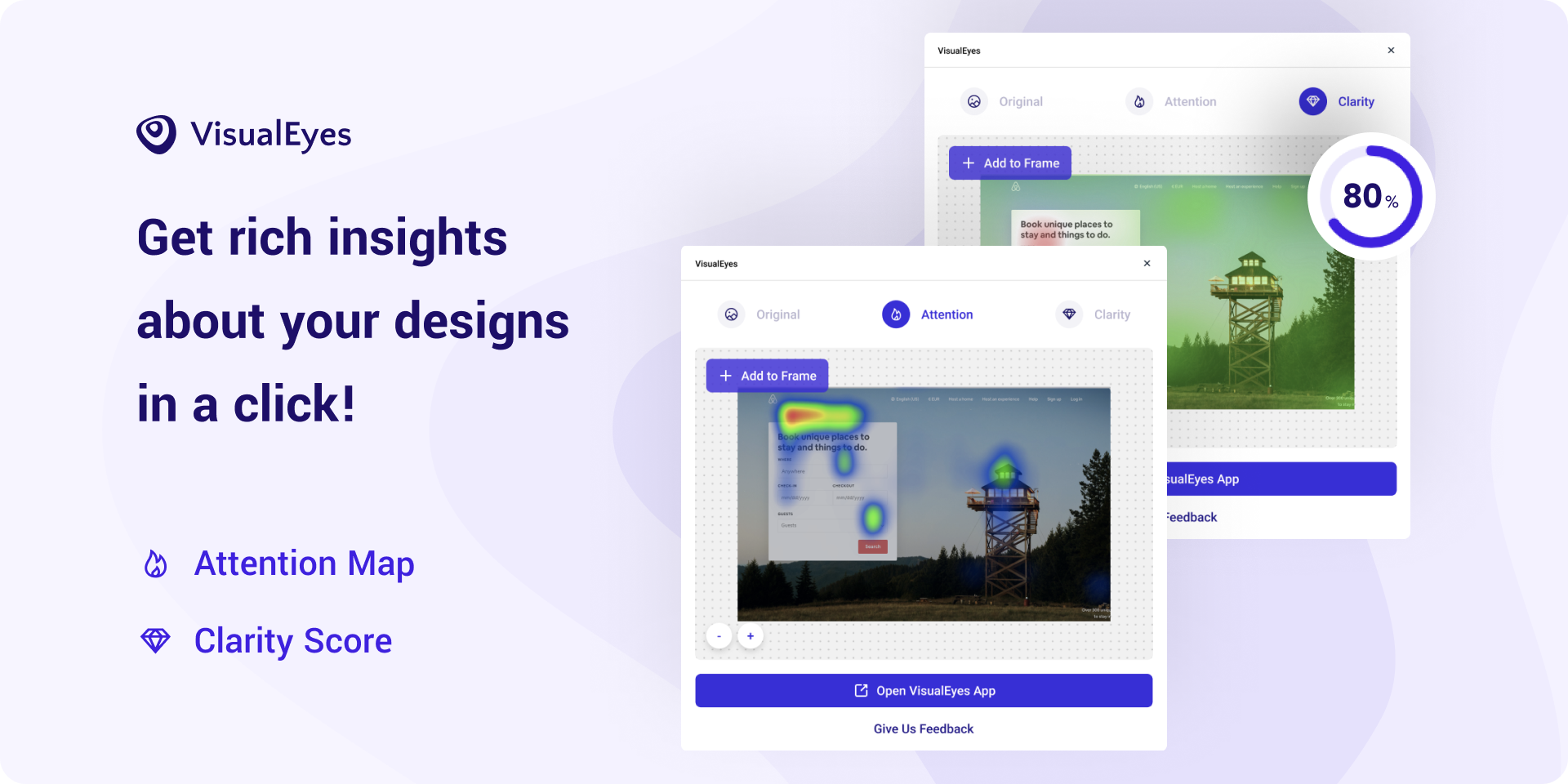
VisualEyes is a tool that can assist you in making informed decisions by using data to guide you. By analyzing historical data, this tool can help you simulate user testing and identify potential usability issues with your prototypes. This way, you can optimize your workflow and create aesthetically pleasing user interfaces. In summary, VisualEyes is a plugin that can help you bridge the gap between design and data.
Features:
- Data-driven decision making
- Simulated user testing
- Usability issue pinpointing
- Workflow optimization
- Beautiful UI design.
Price: Free
Click here to Download the VisualEyes Plugin
30. Avatars Generator
The Avatars Generator is an online tool that produces one-of-a-kind, AI-generated images of fictional people. It's completely free to use and allows anyone to create their own stunning avatar with ease.
Features:
- AI-generated images
- Free to use
- Personal avatar creator
- User-friendly interface
- Unique fictional characters
Price: Free
Click here to Download the Avatars Generator Plugin
Improve Your Figma Experience With Us!
As the demand for user-friendly web design continues to increase, businesses need to ensure that their websites are easy to navigate and visually appealing to their target audience. One effective way to achieve this is by using Figma, a powerful design tool that allows designers to Create Clickable Figma Prototypes of their web designs.
If you're looking to enhance your Figma prototyping experience, you may be interested in RedBlink's Web Designing Services. With a team of experienced Web designers and Web developers, We can help you create stunning clickable prototypes that will engage your audience and drive conversions.
One of the key benefits of working with us is that our designers use Figma plugins, which can help streamline the prototyping process and improve the overall quality of your web designs.
Hire Experts to Get Your Clickable Prototype
Looking To Hire Figma UI/UX Designers - Expert Guide [2024]
Hire Figma Designers
Have you ever visited a website that enticed you to scroll through every page with its pleasing visuals and well-organized layout? The colors, layout, and overall user experience is so perfect and keep attracting you to scroll for more. Well, chances are, that website is designed by a Figma designer.
In that case, who is a Figma Designer?
A Figma Designer is someone who specializes in using Figma, the popular design and prototyping tool. They are skilled at creating beautiful, functional, and user-friendly interfaces for websites, apps, and other digital products.
Figma Designers are not only proficient in website design, but they are also experts in collaboration. Figma is a cloud-based tool that allows multiple team members to work on the same design in real time, making it easy to share feedback and ideas. As a Figma Designer, you'll be working closely with other designers, developers, and stakeholders to bring your designs to life.
But what makes a Figma Designer truly special is their ability to think beyond the pixels. They understand the importance of user experience, and they know how to create designs that not only look great but are also intuitive and easy to use. They use their knowledge of design principles, user psychology, and industry best practices to create interfaces that meet the needs of both users and businesses.
So, how do you find the perfect Figma designer for your website project?
In this complete guide, we'll take you through everything you need to know about hiring a Figma designer, from understanding their role in the design process to the key skills you should look for when selecting a designer, and how to work with them effectively to bring your vision to life.
So, let's get started and learn how to hire UI / UX designer?
Some Facts & Stats

Figma, a widely used design tool, has gained significant traction in the design community. With over 7 million people utilizing Figma for designing, prototyping, and collaborating on projects, it has become a popular choice for design teams worldwide. Here are some of the true facts and stats about Figma:
- According to a survey conducted by UX Tools in 2021, Figma is the most popular design tool among UX designers, with 53% of respondents using it regularly.
- Figma has gained significant popularity among designers and design teams since its launch in 2012. As of 2021, Figma reported having over 6 million registered users worldwide.
- According to Figma's official website, as of September 2021, over 7 million people use Figma to design, prototype, and collaborate on various design projects.
- According to a Figma survey of design teams, as of September 2021, 83% of teams reported that Figma has improved their design team collaboration, and 75% reported that it has increased their design team's productivity.
These statistics highlight the significant impact and widespread adoption of Figma in the design community.
Skills of an Efficient Figma Designer
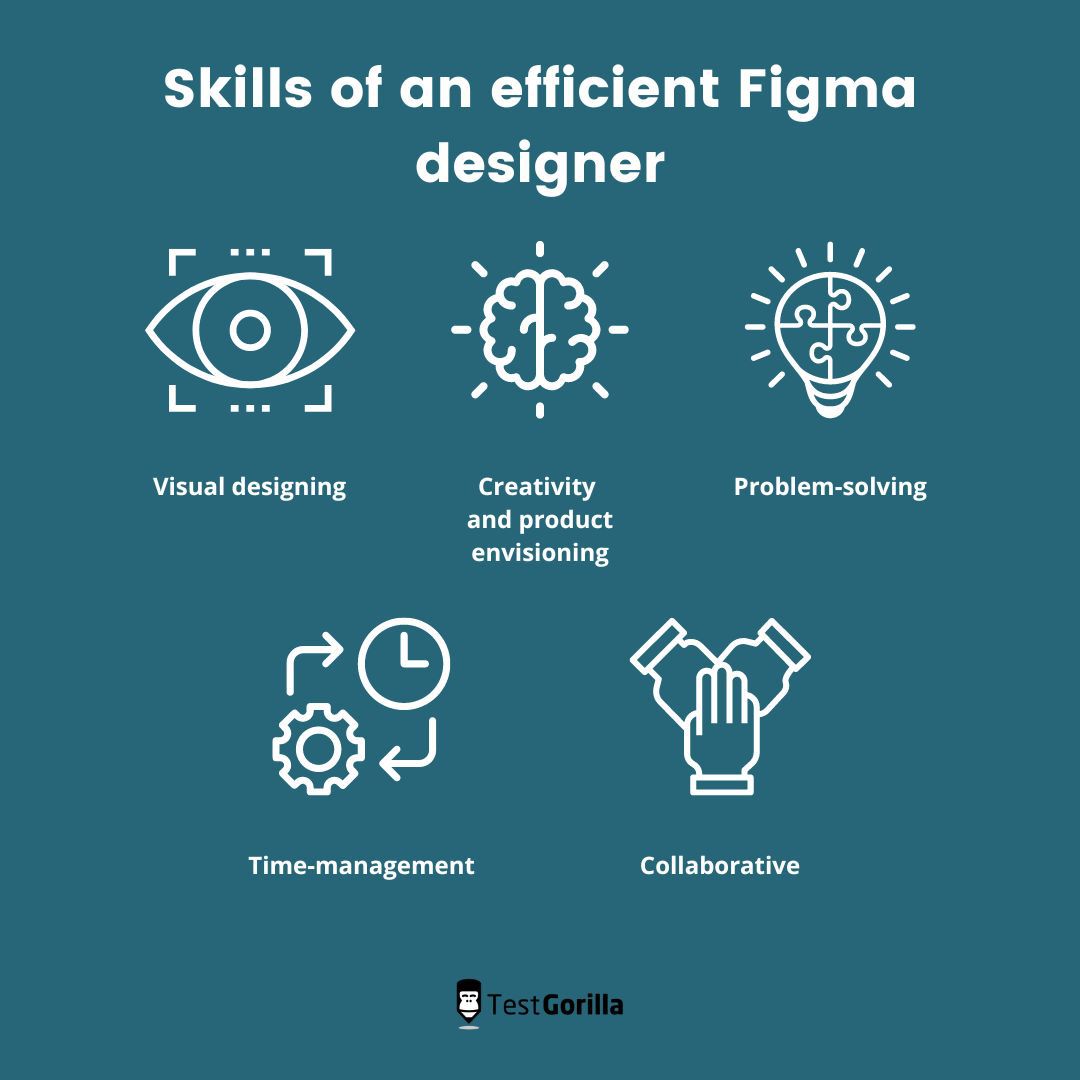
Source - testgorilla
The expertise of top-notch Figma professionals lies in their astute understanding of your company's expectations, and their unwavering commitment to meeting those standards. To achieve this, they wield a diverse set of skills that are essential to their roles:
Proficiency in Visual Designing - A mastery of visual design is indispensable for Figma designers. They possess in-depth knowledge of UI/UX design principles & Psychological Impact of UI/UX, enabling them to skillfully apply them within the platform. With finesse, they can bring your company's requirements to life, crafting captivating designs that resonate with your audience.
Creativity and Product Envisioning - In addition to their visual design acumen, Figma designers possess unparalleled creativity and the ability to envision projects from inception to fruition. They can conceive innovative ideas, and eloquently present them in the most compelling manner possible, elevating your designs to new heights.
Problem-Solving Skills - As they navigate through the design process, Figma designers inevitably encounter challenges. However, their adept problem-solving skills enable them to surmount these obstacles and deliver stellar results. They work collaboratively with their teams, brainstorming solutions, and implementing them with precision.
Time-Management Skills - The significance of effective time management cannot be overstated in the professional realm, and Figma designers are well-versed in this aspect. They adeptly juggle multiple projects, optimizing their time to deliver exceptional work without compromising quality, ensuring timely project completion.
Collaborative Skills - Figma is renowned for its collaborative features, and Figma designers thrive in team environments. They work seamlessly with their fellow team members, including Figma project managers, engineers, and fellow UX/UI designers. They proactively contribute, cooperate, and take the initiative, making necessary corrections to create cohesive and harmonious design projects.
To ensure seamless collaboration among team members, it is imperative for each individual to demonstrate a willingness to invest effort, foster cooperation, take proactive measures, and readily embrace the need for course corrections when required.
Looking to hire Figma designers? First, you need to know .....
What a Figma Designer Can Build For You?
In today's digital age, having an online presence is crucial for any business or individual. However, with the abundance of websites out there, it's more important than ever to make sure your website stands out from the crowd. That's where a Figma designer comes in - someone who can turn your website vision into a stunning reality.
Here are some examples of what a skilled Figma designer can proficiently build for you:
User Interface (UI) Design - Skilled Figma designers can create visually appealing and functionally robust UI designs for websites, web applications, mobile apps, and other digital platforms. These designs may encompass website wireframes, mockups, and interactive prototypes that adeptly showcase the layout, navigation, and visual elements of the user interface.
They measure user experience and know when you need to update your website's UX/UI.
User Experience (UX) Design - A Figma designer can craft intuitive and seamless user experiences by skillfully designing user flows, adding interactions, and information architecture. They can expertly conduct user research, create user personas, and incorporate best practices of usability to ensure that the final product impeccably meets the needs and expectations of the discerning target audience.
Conduct User Research and Testing - Figma designers have the power to conduct comprehensive user research utilizing diverse methods such as interviews, surveys, and rigorous usability testing. They can analyze the data and insights gathered from the research to inform the design process, making data-driven decisions to create a user-centric design. Furthermore, Figma designers can also conduct usability testing on wireframes and prototypes, gathering feedback on the user experience and identifying areas for improvement.
Branding and Identity Designs - These professionals can expertly develop brand identities that reflect professionalism and distinction, including logos, color palettes, typography, and other visual elements that authentically represent your brand's personality and values. These designs can diligently establish a consistent and lasting brand image across diverse touchpoints and marketing materials.
Illustrations and Graphics - Such Figma experts can skillfully create bespoke illustrations, icons, infographics, and other graphics that elevate the visual appeal and eloquently convey key messages of your designs. These visually-arresting elements can seamlessly bring creativity and uniqueness into your digital products, making them more captivating and memorable.
Design Systems and Style Guides - Figma designers are proficient in developing comprehensive design systems and style guides that document the visually appealing UI and web design." These comprehensive guides can serve as a reference for your team and ensure consistency in design across different screens and devices.
Collaborative Design Workflows - These experts can set up and proficiently manage collaborative design workflows utilizing Figma's robust collaboration features. They can deftly create design libraries, design components, and design systems that empower team members to collaborate seamlessly and efficiently on design projects, elevating the overall productivity and effectiveness of the team.
Responsive Designs - Figma designers possess the expertise to create Responsive or Mobile First designs that adapt to different screen sizes and devices, ensuring that your digital product looks and functions optimally across various platforms, including desktop, mobile, and tablet.
Presentations and Documentation - They can create visually-engaging presentations and comprehensive documentation that cogently showcase design concepts, expound on design decisions, and meticulously provide design specifications to esteemed stakeholders, clients, or development teams.
As a Figma designer, the possibilities are vast and varied. From UI and UX designs to branding, illustrations, design systems, and more, Figma designers are endowed with the expertise and acumen to proficiently create a wide array of digital design assets that deftly cater to your distinctive requirements and bring your visionary ideas to life.
How Much Does a Figma Designer Cost?
When it comes to determining the budget for a Figma designer, several factors come into play, such as the designer's experience, skill level, location, and the specific project or role they will be undertaking. Figma designer's annual salary with a few years of experience could be approximately $70,000 to $122,000.
However, a more seasoned designer with 5 or more years of experience could potentially earn anywhere from $120,000 to $189,000 per year.
For those considering hiring a freelancer or contract designer, the hourly rate can vary significantly, ranging from approximately $58.32 an hour. This is the equivalent of $2,332/week or $10,108/month. It's important to keep in mind that these figures are rough estimates and that the budget for a Figma designer may fluctuate depending on the complexity of the project and the level of experience required.
Additionally, it's crucial to remember that budgeting for a Figma designer isn't solely limited to salary costs. Other expenses, such as benefits, office space, equipment, and software, also need to be taken into consideration when determining the overall budget.
Having a clear understanding of your project requirements and budget, and being open to negotiation with the designer, is essential in order to ensure a successful collaboration and achieve the desired results.
How Do You Know If a Designer Is Good?
Are you looking to hire a talented Figma designer for your next project?
Evaluating the skill and expertise of a Figma designer is crucial when hiring or working with a Figma designer. To gauge their proficiency, here are some crucial indicators that can help you in making an informed decision:
- Portfolio: Proficient Figma designers must have a comprehensive portfolio that showcases their diverse range of previous work. Look for a variety of projects that exemplify their design skills, creativity, and ability to deliver visually captivating and functional designs.
-
- Experience: Look for designers who possess relevant experience in the specific type of design work you require. For instance, if you need a UI/UX designer, seek out someone with a proven track record in designing user interfaces and crafting seamless user experiences.
- Design Skills: A skilled Figma designer must have a strong grasp of design principles, typography, color theory, and layout. They should also be adept at utilizing Figma software and other relevant design tools to create stunning visuals.
- Attention to Detail: Thorough attention to detail is a hallmark of a good designer. Examine the precision of elements such as spacing, alignment, and consistency in their designs to determine their keen eye for detail.
- Effective Communication: A proficient designer can effectively communicate their ideas, concepts, and design decisions to clients or team members. They should also be open to feedback and able to incorporate it into their work seamlessly.
- Creativity and Problem-Solving Skills: A top-notch designer possesses creative problem-solving skills and can come up with innovative solutions to design challenges. Look for evidence of creativity and unique approaches in their portfolio and past projects.
- Client Testimonials and References: Request client testimonials or references from previous clients or colleagues to gain insights into the designer's work ethic, professionalism, and ability to meet deadlines. This can provide valuable feedback on their performance.
- Professionalism and Work Ethic: A reliable and responsive designer with a strong work ethic is essential. Assess their professionalism, work ethic, and ability to work independently or as part of a team to ensure smooth collaboration.
Carefully evaluating these factors can assess the quality of a Figma designer and make an informed decision when hiring or collaborating with one. Remember, thoroughly evaluating their skills, experience, and portfolio is crucial to finding the perfect fit for your specific design needs.
What Type of Figma Designers Do You Need?
When seeking to employ a Figma designer, it is paramount to initially identify the specific skill set required for the role. However, it is also crucial to determine the type of employment arrangement that best suits your project.
Options for hiring a Figma designer include an in-house designer, a freelancer, or a design agency. Each option has its own set of advantages and disadvantages, necessitating a thorough evaluation to determine the best fit for your needs.
In-House Figma Designer
Having a permanent Figma designer on your staff means they will become an integral part of your organization, fully understanding your goals and vision. They are likely to be more dedicated to the success of the company and take greater ownership of their work.
This option is similar to having an in-house Figma team that assumes complete responsibility for the product from inception to completion. But, hiring a permanent Figma designer entails the traditional costs associated with employee compensation, such as a fixed salary, taxes, bonuses, and pension contributions.
Contractor / Freelance Figma Designer
You may be wondering, Why should I hire a freelance Figma designer? Engaging a freelance Figma designer can be a good option if your project has a defined timeline. For instance, if you are building a prototype and need to test its viability before committing to permanent staff, hiring a ux designer can be ideal. It is also easier to hire freelancers with specific expertise for specific tasks within a set time frame, without the need for them to be as invested as a permanent employee. Figma designer hourly rate can be vary depending on the project requirements.
But, there is a common challenge while working with Freelance designers that they may lack organizational skills and require more supervision to ensure they are working diligently on your project.
Outsource a Figma Design Agency
A reputable Figma design agency typically offers a wider range of skills and can be a valuable technical partner for larger projects. They provide a structured approach and are generally more reliable.
If you select the right agency, they will provide designers with extensive experience and expertise, allowing for varying levels of collaboration depending on your project requirements. Additionally, as their success depends on their reputation, they tend to deliver higher quality results compared to freelancers.
However, choosing an incompetent agency may lead to delays and a waste of time and resources. This is particularly true when opting for cheaper agencies that may have a strong sales team but lack an efficient design process, quality assurance, junior team members, and work ethic.
Therefore, it is essential to hire a reliable agency like RedBlink to get quality work and visual-appealing Figma designs for your website.
Hire The Best Figma Designer With RedBlink!
Are you looking to hire Figma Designer for product design? Look no further than RedBlink, your go-to destination for outsourced design solutions. Our team of talented and experienced Figma Designers is ready to help bring your website vision to life with their expertise in creating stunning and user-friendly designs.
At RedBlink, we understand the importance of a well-designed website in today's digital landscape. A visually appealing and user-friendly website can greatly impact your online presence and help you stand out from the competition. Our team of Figma Designers is skilled in creating modern, responsive, and intuitive designs that are tailored to your specific needs.
How hiring a Figma Designer through RedBlink works
Hiring a Figma Designer through RedBlink, A Step-by-Step Guide:
- Post Your Project: To embark on your search of hiring figma designer, the first step is to submit your project requirements through our contact form. This entails providing intricate details about your project, including its scope, timeline, budget, and any other specific requirements you may have.
- Receive Proposals: After your project goes live, a plethora of skilled Figma designers on RedBlink will start submitting proposals. You will have the luxury of examining each proposal and comparing the designer's portfolios, ratings, and reviews to make an informed decision.
- Interview Designers: Once you have received proposals, you can conduct interviews with the Figma designers you find captivating. RedBlink's built-in messaging system allows you to communicate with designers and ask any questions that can help you determine the best designer for your project.
- Hire a Designer: After finding the designer that meets your standards, you can officially hire them using RedBlink's secure payment system. This system ensures that you only release payment once you are satisfied with the work delivered.
- Work Together: Once you have successfully hired a Figma designer, you'll collaborate with them to create your website design. RedBlink's platform facilitates effortless collaboration on design files and the provision of feedback.
Hence, RedBlink is the perfect platform to locate and hire an exceptional Figma designer for your website design project. With our exceptional pool of talented designers, a secure payment system, and an outstanding collaboration interface, RedBlink offers a streamlined process for hiring a Figma designer.
Get in touch with us to hire an outsourced Figma Designer for your website..
Additionally, we request you to check out our portfolio to see the kind of high-quality designs we've created for other clients. By browsing through our portfolio, you can get a better idea of the kind of work we do and the level of quality you can expect from us.
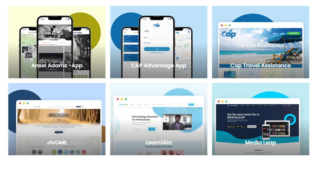
Take Your Website Design to the Next Level - Hire a Figma Expert
Our friendly team will be happy to discuss your design requirements, provide you with a quote, and help you get started on your website design project.
When you choose RedBlink for outsourced Figma design, you can expect:
- Professional Expertise: RedBlink boasts a team of highly skilled and experienced Figma designers who are well-versed in the latest design trends and techniques. We can create stunning designs that align with your brand image and business goals, ensuring your website stands out from the competition.
- Customized Solutions: Our Figma designers take a personalized approach to understand your specific needs and deliver tailor-made design solutions that cater to your website's purpose, target audience, and overall aesthetics.
- Timely Delivery: RedBlink values your time and understands the importance of meeting deadlines. We are committed to delivering projects on time, without compromising on quality. You can rely on RedBlink to keep your project on schedule and ensure a smooth design process.
- Cost-effective: Outsourcing your Figma design to RedBlink can save you time and money. This will avoid the overhead costs associated with hiring a full-time in-house designer, while still getting high-quality design services that meet your requirements.
- Seamless Communication: RedBlink ensures seamless communication throughout the design process. Their team maintains regular communication channels to keep you updated on the progress of your project, gather feedback, and make revisions as needed.
Don't let subpar website design hold you back from achieving online success. Contact RedBlink today to hire a skilled Figma Designer who can transform your website into a visually stunning and user-friendly online platform. Partner with RedBlink for all your Figma design needs and take your website to new heights!
Hire Figma Design Experts to Get Your Clickable Prototype Done
Dental Web Design Trends You Shouldn't Ignore in 2024
Dental Web Design Trends
Are you a dental professional looking to enhance your online presence? ? Do you want to update your site with the latest dental web design trends for the upcoming year? ?? Or maybe you want to know how to create a website that not only attracts new patients but also retains existing ones. ?
If so, then you've come to the right place. In this post, we'll explore the top dental web design trends for 2024 and provide insights into how you can leverage them to make your website stand out in a crowded digital landscape.

So, get ready to take your dental practice to the next level with these cutting-edge web design trends.
Requirements of a Dental Web Design in 2024
The design trends of dental websites are rapidly changing. Building a fresh or redesigning dental website in 2024 focuses on creating a strong digital presence for your dental practice. A custom dental website must represent dental practices to capture the attention of people looking for dental services. The website must include-
# Your Brand Identity
Your dental website design plays a critical role in establishing your brand identity and reflecting your dental practice. It's essential to use relevant colors, fonts, and overall style that align with your brand identity including images of the actual dental clinics.
# Your Professionalism
The healthcare website design can effectively communicate your values and what sets your dental practice apart from others. Instead of choosing a fancy design, you can opt for a simple and realistic design that reflects your business.
# Your Services
Apart from this, your website design must mention your services and how you can facilitate patients. You can mention – how to book an appointment, a list of specializations doctors have and clinic timings, and so on.
Also using clear and concise headings and visual elements can effectively communicate your services to visitors.
# Your Digital Presence
A visually appealing website alone is insufficient if it can't be found by search engines. Optimizing the website for searchability is crucial for dental clinics. Relevant keywords must be included in the meta tags, URL, and content of the website. Mentioning the location of the office can also help in reaching patients.
However, search trends and popular keywords change over time, making it necessary for dental practices to update their website. Keeping this in mind, let’s explore some of the dental website design trends in 2024.
Tech and Marketing Trends ? to Watch Out For Dental Industry in 2024
Before we know the dental website trends, it is important to first know the dental industry's latest statistics about the dental industry.
The dental market in 2022, was valued at $179.1 billion (USD), including dental surgery, orthodontics, periodontics, and cosmetic dentistry.
The latest areas of growth are - cosmetic surgery, dental implants, and new dental technology.
Add on to the fact that the dental industry in the US is set to continue its growth trajectory in 2024 and beyond, indicating that there is still plenty of room for dental practices to thrive.
With this information, dental website developers can focus on the tech trends that can highlight a dental practice catering to the needs of dentists.
Here are some of the key factors to design a patient-friendly dental website:
✅ Mobile responsiveness
Refers to the ability of a website or application to adjust its layout and design to fit different screen sizes and devices, such as smartphones and tablets. This ensures that the content is easily accessible and readable on any device.
✅ Minimalistic design
Refers to a design approach that prioritizes simplicity and minimalism, by using only the necessary elements and removing any unnecessary clutter. This can improve the user experience by making it easier to navigate and find relevant information.
✅ Video and animation
Refer to the use of video and animation in the design of a website or application. This can help to engage and entertain users, while also providing information or demonstrating a product or service.
✅ Personalization
Refers to the ability of a website or application to tailor the content and user experience to the individual user's preferences and needs. This can be achieved through various methods, such as personalized recommendations, customized user interfaces, and targeted advertising.
The goal is to provide a more relevant and personalized experience for each user.
✅ Adopt Scalable Web Platforms for DSOs
According to a study by the American Dental Association, over 50% of patients search for dentists online before making an appointment.
This highlights the importance of a strong online presence for dental service organizations, particularly for small dental clinics looking to expand their business.
By adopting scalable web platforms, Dental support organizations (DSOs) can increase their online visibility and reach a wider audience, ultimately attracting more potential customers.
✅ Need to write Patient-centric Content
For a dental service, writing patient-centric content is essential. This means providing content that is relevant and informative to patients, addressing their questions and concerns, and helping them make informed decisions about their dental care.
DSOs need to prioritize patient-focused content to establish trust and credibility with their audience.
✅ UX/UI is a priority
User experience (UX) is another critical factor in developing a successful web platform. Patients expect easy navigation, fast load times, and an intuitive design. A poor UX can negatively impact a DSO's reputation and ultimately drive patients away. DSOs need to invest in high-quality UX design to create a seamless patient experience.
ADA compliance requirements for your dental website
A dental website should be ADA-compliant. ADA (Americans with Disabilities Act.) in 1990 aimed to prevent discrimination against individuals with disabilities. A crucial aspect of the law is to ensure that websites are accessible to people with visual, hearing, or physical impairments.
To ensure that a dental care website is ADA-compliant, it must adhere to specific guidelines, including :
? Captions on Videos or Sound Files
To cater to individuals with hearing impairments, audio content on the website should have a transcript available, while videos must be played with captions turned on by default.
⚡ Alternatives to Flash
If your website uses Flash, it must have an alternative that is accessible. The website must be visually appealing even for people having visibility problems.
? Navigation
The website's main page must follow web standards for keyboard and screen reader navigation, including backward and forward browser functionality.
✍️ Content
The dental website's content, including links, images, and forms, should be accessible through assistive technologies such as screen readers. Alt text should accompany all images to describe visually impaired users.
HIPAA Compliance Requirements For Your Dental Website?⚕️
For a dental website development company, it is essential to have an understanding of HIPAA-compliant website design. According to regulations, compliance is not just a matter of adding a lock icon to the website, but federal law also requires safeguarding the privacy of patient's medical information.
As a dentist, if you are hiring a web design agency to design and develop a website for your dental practice, you should ensure that the agency's website designers and developers are aware of HIPAA regulations.
Some of the HIPAA requirements include:
✔️ Disclosures on Forms
HIPAA-compliant website forms should be designed with a link at the top or bottom with detailed information about how data will be used.
✔️ Privacy policy
The website must display the privacy policy prominently so that users can access it quickly at any time and encourage them to read it before committing to using your product or service. The policy must specify the way user information can be used.
✔️ Accessibility
While some of these requirements are included in ADA compliance, HIPAA also mandates certain requirements for ensuring that your website is accessible to all individuals with disabilities.
✔️ Business Associates
If you delegate any work that involves Protected Health Information (PHI), this aspect of HIPAA applies to you. In such a case, it is essential to have a business associate agreement in place that clearly outlines what the business associate can and cannot do with the data they access from your site.
✔️ Security
Developing a website for dental practices must follow the PHI guidelines related to patient data security. For acquiring a HIPAA certification, a federal officer will audit the website.
Additional Dental Web Design Practices to Boost Sales?
This section delves into the top dental website design practices to elevate your dental business. From incorporating user-friendly navigation to highlighting patient reviews and creating a mobile-responsive website, we'll explore the strategies that can make your website stand out and attract more patients. Let’s take a look.
? Online Appointment Booking
Many patients today prefer to book appointments online rather than calling the dental practice. By offering an easy-to-use online booking system, patients can book appointments at their convenience, even outside of business hours.
For example, a dental practice may use booking software such as Zocdoc, which allows patients to book appointments directly from the practice's website.
⭐Testimonials and Reviews
Including patient testimonials and reviews on the website can help build trust and credibility for the practice. Positive reviews and testimonials from satisfied patients can help prospective patients feel more comfortable and confident in choosing a dental practice. Adding video testimonials to websites builds a high level of trust among users.
For example, a dental practice may feature patient testimonials on its website, social media platforms, and third-party review sites such as Google Reviews, Yelp, or Healthgrades.
? Integration with Social Media
According to a study by the American Dental Association, dental practices that use social media platforms such as Facebook, Twitter, and Instagram to engage with patients report higher patient satisfaction and retention rates.
Social media integration can help the dental practice connect with patients, build an online community, and drive traffic to the website.
? Economic Uncertainty Impacts Marketing Strategy & Investments
The COVID-19 pandemic has created economic uncertainty across all industries, including dentistry. DSOs (dental support organizations) need to be mindful of their marketing investments and adapt their strategies to the changing landscape. This may mean reallocating resources to online channels or experimenting with new forms of advertising.
? Dental’s Digital Transformation Continues
The dental industry's digital transformation shows no signs of slowing down. With advances in technology and changing patient expectations, DSOs need to stay ahead of the curve to remain competitive. This means investing in the latest digital tools and platforms to provide patients with the best possible experience.
? AI Investments Increase and Strengthen Market Position/USP
Artificial intelligence (AI) is another key trend that DSOs need to be aware of. AI can help DSOs automate routine tasks, streamline workflows, and provide more personalized experiences. As AI becomes more accessible, DSOs that invest in this technology can gain a significant competitive advantage.
Trust RedBlink for HIPAA-Compliant Website Development
In today's digital age, a strong web platform is essential for DSOs to stay competitive and continue growing. By prioritizing patient-centric content, UX design, personalization, and the latest digital tools, DSOs can create an exceptional online experience for their patients.
Ready to Grow?
We hope you got an idea of what can set your dental practice apart from the rest. Look no further than RedBlink! Book an appointment for a free consultation with our web designing team specializes in creating websites specifically for dentists and DSOs.
We can incorporate the latest trends and features like simple navigation, service-based content, and location-based dental care to make your website stand out. So, let us know what you need. We are here to assist you.
Types of Generative AI Models Explained [Diffusion GAN VAEs]
Generative Ai Models
Just type a few words of prompt and you will get an answer in the text, image, audio, video, or other forms as you expected. This is something known as generative AI models and the hype of it is growing rapidly.
Gartner, a technology research firm, has included generative AI in their Emerging Technologies and Trends Impact Radar for 2022 report, recognizing it as one of the most impactful and rapidly evolving technologies that can revolutionize productivity.
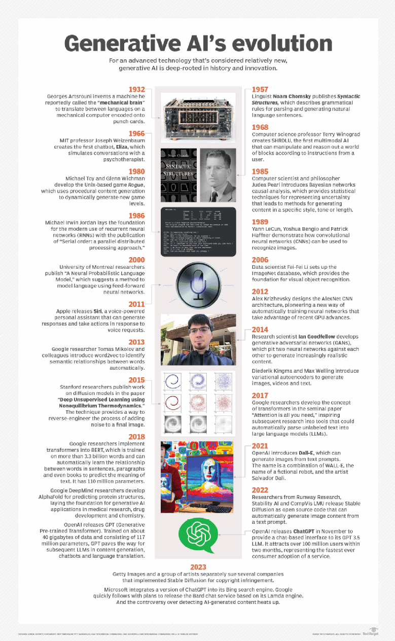
Source - techtarget.com
According to Gartner's predictions:
- By 2025, generative AI will be producing 10% of all data (now it’s less than 1%) with 20% of all test data for consumer-facing use cases.
- In addition, 50% of drug discovery and development initiatives will be using generative AI till 2025.
- And, 30% of manufacturers will use the technology to improve their product development effectiveness by 2027.
Now, you know how vital it is to adapt generative AI to remain competitive in your business domain. After all, it is all about staying updated with the rapidly changing digital landscape.
In this post, let’s get to know more about Generative AI tools that can be helpful for you in harnessing AI power in your applications.
What are Generative AI Models?
Generative artificial intelligence (AI) models are a combination of various AI algorithms used to represent and process content. These models utilize natural language processing techniques to generate text, transforming raw characters such as letters, punctuation, and words into sentences, parts of speech, entities, and actions, which are then represented as vectors using multiple encoding techniques. Images are also transformed into various visual elements, also expressed as vectors.
However, these techniques can also encode biases, racism, deception, and puffery that exist in the training data. ChatGPT Developers must be cautious of these limitations while representing data.
Once developers select the representation of data, they apply a specific neural network to generate new content in response to a query or prompt. Techniques such as Generative Adversarial Networks (GANs) and Variational Autoencoders (VAEs) are appropriate for generating realistic human faces, synthetic data for AI training, or facsimiles of particular humans.
Transformers such as Google's Bidirectional Encoder Representations from Transformers (BERT), OpenAI's Chat GPT, and Google AlphaFold have advanced progress in generating new content. In addition to encoding language, images, and proteins, these neural networks can also generate new content.
What is the Best Way to Evaluate Generative AI Models?
Here are the following things you should take into account while evaluating generative AI models:
- Quality: When it comes to applications that interact with users, the quality of the generated output is of utmost importance. In speech generation, for instance, if the quality of the speech is poor, it becomes challenging to understand. Similarly, in image generation, the desired outputs should be visually indistinguishable from natural images to be considered of high quality.
- Diversity: This is another crucial factor to consider. A good generative model should be able to capture the minority modes in its data distribution without sacrificing generation quality. This helps reduce any undesired biases in the learned models.
- Speed: Many interactive applications require fast generation, particularly real-time image editing, to allow for use in content creation workflows. As such, speed is a significant consideration when evaluating generative AI tools.
https://twitter.com/Contrary_Res/status/1585684831437934595
Types of Generative AI Models

There are various types of generative AI models, and the combination of their unique features can lead to even more powerful models. Let's dive deeper into these models:
Diffusion Model/Foundation Model
Diffusion models, also known as denoising diffusion probabilistic models (DDPMs), are a type of generative model used in artificial intelligence and machine learning. These models determine vectors in latent space through a two-step training process, which includes forward diffusion and reverse diffusion. During the forward diffusion process, random noise is gradually added to training data. Conversely, the reverse process reverses the noise to reconstruct the data samples. Novel data can be generated by running the reverse denoising process starting from entirely random noise.
Diffusion models are considered foundation models because of their scalability, high-quality output, flexibility, and suitability for generalized use cases. However, due to the reverse sampling process, running foundation models can be a slow and lengthy process.
Also read Generative AI vs Machine Learning vs Deep Learning Differences
Application of Diffusion Model
- Decision-Making
- Reaction Time Analysis
- Perceptual Decision Making
- Financial Markets
- Medical Diagnosis

Generative Adversarial Networks
Generative adversarial networks, or GANs for short, are a type of machine learning model that uses deep learning techniques to generate new data based on patterns learned from existing data. GANs use two sub-models, a generator and a discriminator, which work together in a game-like setting to produce increasingly accurate examples of the target data.
The generator creates new examples, while the discriminator tries to distinguish between the generated and real examples. Through this iterative process, the generator learns to create examples that are increasingly similar to real data, making GANs a powerful tool for generating new content, such as images, music, and text. Using both imagery and text, such technologies can create visual and multimedia artifacts.
Source - bloomberg
Applications of GANs
- Image Synthesis
- Video Generation
- Data Augmentation
- Style Transfer
- Anomaly Detection
- Text-to-Image Synthesis
Transformer-Based Model
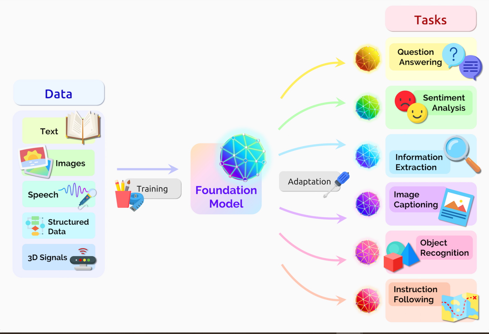
Transformer-based models are neural networks that excel at learning context and meaning by closely analyzing relationships in sequential data. These models, including GPT-3 and LaMDA, operate using cognitive attention and evaluate the importance of various pieces of input data. Essentially, transformers are designed to comprehend language or images and then generate texts or images using enormous datasets as their basis for learning. For example, technologies such as generative Pre-Trained (GPT) language models can use information from the Internet to create content for websites, press releases, and whitepapers.
Applications of Transformer-Based Model
- Language Translation
- Sentiment Analysis
- Chatbot and Virtual Assistant
- Questioning Answering
- Content Creation
- Detect Trends and Anomalies
Variational AutoEncoders (VAEs)

Variational AutoEncoders (VAEs) are a type of generative model, similar to Generative Adversarial Networks (GANs). VAEs consist of two neural networks, encoders, and decoders, that work together to create the most effective generative models. The encoder network learns to represent the data more efficiently, while the decoder network learns to regenerate the original dataset more efficiently.
VAEs are incredibly useful for creating complex generative models of data, especially when working with large datasets. Using a VAE, you can generate new images by sampling from the latent distribution, allowing you to create unique and original images.
By optimizing for both the efficient representation and regeneration of data, VAEs are able to create highly effective generative models. This makes them an excellent choice for anyone looking to create new and unique content using AI-generated models.
Applications of Variational AutoEncoders
- Image and Video Generation
- Anomaly Detection
- Music Generation
- Data Imputation
- Dimensionality Reduction
- Signal Processing
- Security Analytics
What Kinds of Output Can a Generative AI Model Produce?
Generative AI models can produce outputs that are virtually indistinguishable from human-generated content. However, there can be instances where they seem a little odd or uncanny. So, the results depend on the quality of the model, which has seen remarkable progress in recent years, and the appropriateness of the input.
In just ten seconds, ChatGPT can produce an essay. Have you ever wondered about the incredible capabilities of ChatGPT and the wide-ranging benefits it offers? Immerse yourself in this enlightening post titled "What is ChatGPT and Its Benefits?" and uncover the answers you seek.
The AI art model, DALL-E can generate a variety of bizarre yet stunning images, including a Raphael painting of a Madonna and a child, munching on pizza. Similarly, other generative AI models can produce code, video, audio, or business simulations.
However, the outputs are not always precise, nor are they suitable for every context. When asked to generate an image for Thanksgiving dinner, DALL-E 2 produced a picture of a turkey garnished with whole limes beside a bowl of what appeared to be guacamole. Moreover, ChatGPT struggles with basic algebraic problems and counting, as well as the inherent sexism and racism that is prevalent in society and the internet.
Generative AI outputs are the result of the data that trains the algorithms, which is usually massive in size. Since these algorithms' training data is vast, with GPT-3 trained on a staggering 45 terabytes of text data, the models can appear to be creative when producing outputs. Furthermore, the models often contain random elements that enable them to produce multiple outputs from a single input request, which contributes to their lifelike qualities.
What Kinds of Problems Can a Generative AI Model Solve?
You may have noticed the popularity of generative AI tools, like ChatGPT, that can produce hours of entertainment. However, the potential for businesses to leverage these tools is even greater.
- Generative AI models can produce credible writing in seconds, making them a valuable tool for organizations that require clear written materials.
- Generative AI models have proven to be beneficial for IT and software companies as they are capable of producing accurate code on demand.
- Marketing departments can leverage generative AI to quickly and efficiently generate copywriting and other marketing materials.
- Generative AI finds its applications in technical fields like creating higher-resolution medical images or performing data analysis.
Apart from the above-mentioned benefits, generative AI can also assist organizations in saving both time and resources. This is achieved by simplifying the writing process and reducing human involvement, allowing companies to explore new business opportunities and generate more value for their stakeholders.
It is important to note that creating a generative AI model is a complex task that requires significant resources. Typically, only large corporations with ample resources can undertake such an endeavor. However, smaller companies can still benefit from using pre-existing models or modifying them to suit their specific needs.
In conclusion, generative AI models offer solutions to a wide range of problems across various industries by enabling organizations to produce high-quality written content rapidly and efficiently. This ultimately leads to the creation of more value for stakeholders, making it a worthwhile investment for businesses of all sizes.
Generative AI models have revolutionized various industries, enabling machines to create art, music, and even realistic human faces. Among these models, Diffusion GAN VAEs stand out for their unique approach to generating high-quality data. But, harnessing the power of these models can be complex for non-coders.
Here's where Code Conductor comes to the rescue! As a user-friendly no-code development platform, Code Conductor allows individuals without coding experience to harness the potential of Diffusion GAN VAEs effortlessly. Whether you're an artist exploring creative possibilities or a business seeking innovative solutions, CodeConductor and Diffusion GAN VAEs make it accessible to all.
Wrapping Up!
The realm of generative AI has given birth to a myriad of models that are transforming the business landscape. We have delved into some of the most popular and avant-garde generative AI models that are actively utilized by businesses today. OpenAI's GPT-3 has emerged as a game-changer in natural language processing, while Google's Magenta has facilitated the production of unique and authentic music compositions. DALL-E has taken generative art to new heights, enabling the creation of breathtaking and surreal images. Lastly, Generative Pre-trained Transformer 2 (GPT-2) has made significant progress in developing chatbots that can simulate human conversation.
These generative AI models are constantly evolving, with their applications in business set to expand further. As more data becomes available and these models continue to learn, they will undoubtedly provide businesses with innovative ways to automate tasks, customize interactions with customers, and even generate completely new products and services. With the potential of generative AI at their disposal, businesses can anticipate an era of unprecedented growth and ingenuity.
RedBlink is a top-rated Generative AI Development Company known for delivering cutting-edge web application softwares and guiding how to build a generative AI solutions. We harness the power of advanced Generative AI applications to drive innovation and foster growth. If you're looking to hire ChatGPT developers with expertise in generative AI models, RedBlink is here to assist you. Our AI consultants have proven track records in developing advanced generative AI solutions.
At RedBlink Technologies, as a generative AI development company, we specialize in AI tools and have a wealth of experience in generating high-quality datasets. Our generative AI tools are capable of producing vast amounts of data that meet the highest standards.
If you're unsure which tool would be best for your business needs, we offer consultations to help guide you toward the right choice. Trust us to provide expert advice and assistance with all your AI needs.
Integrating Generative AI models into your business can revolutionize its potential. RedBlink's Artificial Intelligence Services & Solutions can harness the power of AI to unlock innovative solutions tailored to your specific business needs. Our expertise spans diverse industries, ensuring a customized approach. From enhancing creativity to streamlining processes, Our services can propel your business forward.
References
- Variational Autoencoders by Diederik P. Kingma and Max Welling (2013)
- Goodfellow, Ian J., et al. "Generative adversarial networks." arXiv preprint arXiv:1406.2661 (2014).
- Deep Generative Models by Ian Goodfellow, Yoshua Benigo, and Aaron Courville (2016)
- DALL-E: A Large Language Model for Generative Image Synthesis by OpenAI (2021)
- Generating High-Fidelity Images on Small Compute with Wavelet-based Super-Resolution by Seungwook Han, Akash Srivastava
Designing A Veterinary Website: Top Do's And Don'ts
Designing A Veterinary Website
As a compassionate and dedicated veterinarian, your top priority is to provide unparalleled care to your patients and express your love for pet care and veterinary practice. However, in today's fast-paced digital age, having a website is just as indispensable to your success as having the necessary medical equipment and expertise.

A survey by the American Veterinary Medical Association states that “80% of pet owners use the internet to search for pet health information and veterinary services”
It highlights that a well-designed website can serve as an all-encompassing online hub for your vet practice. A veterinary website can speak about the high-quality service offered, location, visiting hours, and so on. Also, all the information for the users to reach the doctor easily is provided. An interface that will directly answer patients’ queries can be added.
Further optimizing a vet website for SEO can help in increasing online visibility and attract pet owners to reach the best veterinary doctor nearby.
What's more, the website will help to collect vital client information and offer online appointment scheduling. To help you get started with your veterinary website, let’s discuss the dos and don’ts for designing a scalable website meeting business objectives.
Dos and Don’ts of Veterinary Website Design
Dos of a Veterinary Website Design
A website not only serves as an online platform for your vet business, but it also helps you connect with your customers by building a brand. Here is a list of must-dos that will help in designing a functional website.
-
Identify Your Target Audience
Understanding your target audience will help you create a resonating website. Answering people's queries and providing informative content will help in reaching your potential customers. For example, if your practice primarily serves elderly pet owners, your website design should include larger font sizes and simplified navigation.
-
Make Your Website Mobile-Friendly
Having a mobile-friendly website is no longer an option, but a necessity especially for essential services like vet service. Services like allowing patients to schedule appointments through their mobile phones will improve your popularity in the local area.
-
Ensure Your Website is Easy to Navigate
Veterinary Website Design should be intuitive and easy to use. A clear and organized menu structure can help visitors quickly know a doctor’s services. A navigated site allows a satisfying browsing experience.
-
Use High-Quality Images and Videos
Images and videos can also help communicate your brand's message more effectively than text alone. You can add real-time images and videos to the way you treat patients. A preview of services will help people trust your veterinary services.
-
Use Calls-to-Action to Encourage Engagement
CTAs encourage visitors to take specific actions, such as scheduling an appointment or contacting your practice. Including clear and prominent CTAs on your website can help increase user engagement and conversions.
-
Incorporate Social Media Links
Social media can advertise your veterinary practices. Rather than creating hype about your service, you can post useful tips for pet care. It will help people and also increase their interest in taking consultations from your pet care clinic.
-
Keep Your Website Up-to-Date
A pet clinic or veterinary hospital is a place where the patient regularly visits for regular checkups and vaccinations. If the necessary tips are provided on the website, people having pets will visit your website. This will result in increasing website traffic. Regular updates will further increase the traffic on your website.
-
Testimonials and Reviews
Including testimonials and reviews from satisfied customers will help you beat the market competition. After all, word of mouth is most important for a doctor’s practice. However, Positive reviews will convince potential customers to choose your practice.
-
Consistent Branding
Consistent branding is essential for building brand recognition and trust with customers. Your website's design should be consistent with your practice's branding, including colors, logos, and messaging.
Don'ts for Designing Veterinary Website
Your website's design can impact your search engine rankings and can boost your practice. Therefore, it is important to design a website that is essential for your veterinary practice. So, here we are listing some don’ts that will help you design a better website:
-
Don't use stock photos
While stock photos may seem like an easy way to add visual appeal to your website. Stock photos can appear generic and irrelevant for new patients to visit your clinic. Instead, use high-quality, original images that showcase your vet practice.
-
Don't overload your website with information
It's essential to provide valuable information about your practice and services. But too much information can confuse visitors. Ensure your website is concise, clear, and easy to understand for a common user.
-
Don't use small or hard-to-read fonts
Font size and readability are critical factors for developing a UX UI website. Avoid using small, hard-to-read fonts to avoid difficulty in reading. Opt for clean, easy-to-read fonts that are at least 16px in size with a clear font face.
-
Don't use too many colors or fonts
Overuse of colors and fonts can distract visitors. Stick to a consistent color palette and font scheme throughout the website. Maintain a consistent and cohesive look and feel.
-
Don't neglect the importance of SEO
Search engine optimization (SEO) is important to reach the maximum number of visitors. Optimize your website with relevant keywords, meta tags, heading tags, and alt tags to improve the search engine visibility of a website.
-
Don't forget to install SSL
A website providing medical services must add security features. Don’t forget to install an SSL certificate, firewall, and two-factor authentication. Ensure your website's software is up-to-date. You need to check the website for security threats.
-
Don’t forget to check the website loading Speed
If your website takes too long to load, it can result in a negative user experience, causing frustration and impatience. This may prompt users to abandon your website and seek alternatives.
Research indicates that even minor delays of a few seconds can significantly decrease conversions. To avoid this, focus on improving your website's loading speed by reducing image size and minimizing the number of requests made. Implementing caching mechanisms can also enhance page load times.
-
Don't Ignore Accessibility
Accessibility will help users to interact with your website, including those with disabilities. Ensure your website meets accessibility standards by using descriptive alt tags and providing captioning for videos. Choosing a layout as per services will help in designing an accessible website.
-
Cluttered and confusing layouts
A cluttered and confusing website layout can create difficulty to navigate for visitors. Keep your website's design clean, simple, and consistent to improve UX UI.
Additional Tips for Veterinary Websites
Here are a few more pointers to assist you in developing your veterinary website that accomplishes your business goals. Now that we've covered the most crucial do's and don'ts for your website, here are some additional tips:
- Don't overlook the value of images for your website. Enhancing both the aesthetic and user experience of your website with high-quality real-time images will provide more authenticity to your website.
- In the header or footer, provide your contact details to schedule an appointment.
- Use simple language in CTAs so that people find form filling convenient. Also, responding to queries will help you build trust with visitors approaching you
- Make sure your website is responsive. Also, check all the links, buttons, and submit are working. A flawless UX UI will surely make a difference in delivering the best veterinary service.
Conclusion
In conclusion, you can create a website that is user-friendly, engaging, and accessible to visitors by following the dos and don’ts of a veterinary website design. Above all, design a website that is for patients looking for veterinary services. To design an engaging website, you need to hire a professional veterinary website design agency.
Choosing a leading agency that has experience in designing and developing medical websites can help your veterinary business grow. Schedule an appointment to take our expert advice and design a pro veterinary website!
RedBlink is a prominent agency in healthcare website design, with a specialization in creating HIPAA-compliant mobile applications and websites for healthcare professionals, including plastic surgeons, physical therapists, dermatologists, and others.
Figma Clickable Prototypes - Interactive UX/UI Designs [Guide]
Figma Clickable Prototypes
Discover the power of Figma, the exceptional tool for crafting UX/UI prototypes with ease and efficiency. With its advanced features and intuitive interface, Figma enables you to transform static designs into dynamic and interactive experiences within minutes.
In this comprehensive guide, we delve into the innovative Figma Interactive Components (currently in beta), which revolutionize the way we create prototypes by minimizing the resources required for design exploration.
Whether you're a seasoned Figma user or a newcomer, all you need is a complimentary Figma account to unlock your prototyping potential.
Learn to master interactions, animations, fixed positions, overflow scrolling, and interactive components in your prototypes with Figma today.
Prototyping Basics
A prototype is a preliminary model of something. In software development, a prototype is often a temporary and quick model of a product that is still under development. Prototypes are used to evaluate feasibility, test user reactions, and gather feedback.
There are two types of prototypes: low-fidelity and high-fidelity. Low-fidelity prototypes are usually simple and quick to make. They are often made with paper, pencil, or cardboard. High-fidelity prototypes are usually more complex and take longer to make. They are often made with software or computer-aided design tools.
There are four main stages of the prototyping process: ideation, development, testing, and revision.
Ideation is the first stage of the prototyping process. This is when you come up with ideas for your product. You might brainstorm with a team or work on your own. Once you have some ideas, you can start developing them into prototypes.
Development is the second stage of the prototyping process. This is when you take your ideas and turn them into actual prototypes. You will need to decide what materials to use and how to put your prototypes together. This is usually the most time-consuming stage of the prototyping process.
Testing is the third stage of the prototyping process. This is when you test your prototypes with actual users. You want to see how they react to your product and get their feedback. This stage can help you improve your product before you release it to the public.
Revision is the fourth and final stage of the prototyping process. This is when you take the feedback from testing and revise your prototypes. You might make some changes to the design or functionality of your product. Once you are satisfied with your revisions, you can move on to final development and release.
What is a Clickable Prototype in UI/UX Design?
A Clickable Prototype is a visual model that showcases the interface design process & interactive features of a website or application's user interface (UI). Clickable prototypes are extensively used for Interface design, validation, user testing, and other purposes. These prototypes enable users or testers to interact with them by clicking through from one step to the next, just like the final product.
Before you can start designing a clickable prototype, you will need to choose a prototyping tool that suits your needs. Prototyping tools are software applications that designers and developers use to create interactive mockups, wireframes, and prototypes of digital products such as websites, mobile apps, and software. Each designing tool has its strengths and weaknesses, so it's important to choose the one that best fits your design needs and workflow.
Benefits Of Building Interactive UX/UI Designs in Figma?
Clickable prototypes offer several benefits that make them incredibly useful for business owners. These prototypes are interactive, allowing users to test the design and functionality of a product before it is launched in the market. Here are some reasons why clickable prototypes are essential for business owners:
Helps Validate the Product Design
Clickable prototypes provide a realistic preview of how the final product will look and function. It enables business owners to validate the design and make any necessary changes before launching the product in the market. This approach helps minimize any design flaws or usability issues that may lead to negative user experiences.
Provides User Feedback
Clickable prototypes allow business owners to gather user feedback at an early stage of product development. This feedback is critical in making informed decisions and adjustments to the design. Gathering user feedback can also help in identifying potential areas of improvement and feature enhancement. It is highly beneficial in usability testing as the prototype can be tested for UX ( user experience ) and changes can be proposed.
Saves Time and Cost
The expenses involved in creating a website or application can significantly fluctuate based on its magnitude and the specific features you desire. The U.S. Bureau of Labor Statistics estimates that software developers earn about $51.69 per hour. Developing a clickable prototype is a cost-effective approach compared to developing a fully-functional product. It also saves time by allowing business owners to test multiple versions of the design and make changes as required. This approach helps in reducing the overall cost and time required for product development.
Increases User Engagement
Clickable prototypes offer a seamless user experience, increasing engagement and interest. Users can navigate through the prototype, test various features, and provide feedback. This approach creates a positive impression and helps in building brand loyalty.
Hence, clickable prototypes are essential for business owners as they help validate the design, provide user feedback, save time and cost, and increase user engagement. Incorporating clickable prototypes into your product development strategy can lead to a successful product launch and higher customer satisfaction.
Create Clickable Figma Prototype
Figma is a popular design tool that can help you create interactive prototypes with ease. With its intuitive interface and powerful features, you can quickly create clickable prototypes that accurately represent your design vision.
Prototyping Through the Years ( Based on past surveys from 2017 and 2018 )
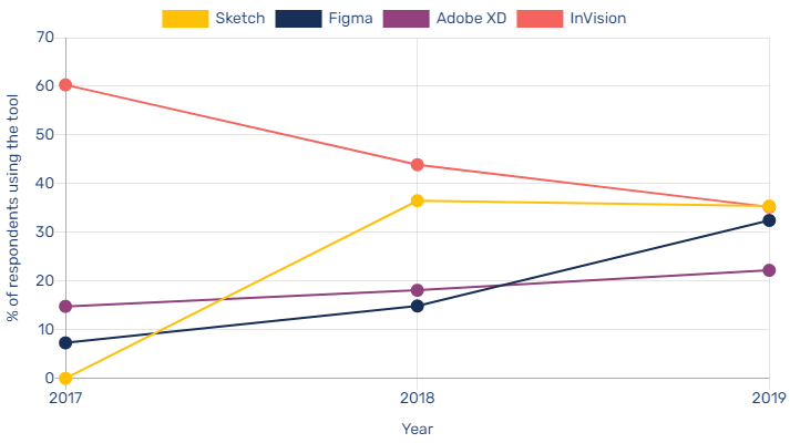
Source - https://uxtools.co/
Before diving into the topic of how to create clickable prototypes in Figma, you should know the ways in which Figma can help you create clickable prototypes.
- Design in a collaborative environment: Figma is a cloud-based design tool that allows you to work collaboratively with team members and stakeholders. This makes it easy to share your work, get feedback, and make changes in real time.
- Create interactive elements: Figma has a robust set of tools that allow you to create interactive elements like buttons, menus, and sliders. You can easily add interactions to these elements and create a realistic prototype that users can click through.
- Preview and share your prototypes: Figma makes it easy to preview and share your prototypes with others. You can present your design in full-screen mode, allowing stakeholders to interact with the prototype as if it were a real app or website.
- Test and iterate quickly: By creating clickable prototypes, you can test your design ideas quickly and iterate on them based on user feedback. This allows you to refine your design and create a better user experience.
Before going further, lets delve into some quick bytes of common FAQs asked by people.
How do you make a Figma interactive prototype?
To make a Figma interactive prototype, follow these steps:
a. Open your design file in Figma.
b. Switch to the "Prototype" tab.
c. Click on an object to select it and then click the "+" icon in the Interaction panel.
d. Choose the desired interaction type and destination frame.
e. Repeat the process for other elements.
f. Click "Present" to preview your prototype.
How do you make a clickable prototype?
To create a clickable prototype, establish connections between design elements and their target frames using the "Prototype" tab in Figma. This creates interactive hotspots that trigger navigation or actions when clicked.
Does Figma have interactive components?
Yes, Figma offers interactive components, which are reusable design elements with multiple states and interactions. These components streamline the prototyping process, allowing for a more dynamic and interactive experience.
What are the limitations of Figma prototype?
Limitations of Figma prototypes include:
a. Limited support for complex animations and transitions.
b. No built-in user testing features.
c. Inability to export prototypes as standalone files.
d. No direct collaboration with developers through the tool.
How do I make my Figma prototype public?
To make your Figma prototype public:
a. Click on the "Share" button in the top right corner of the Figma interface.
b. In the Share modal, click "Change" next to "Link Sharing."
c. Choose "Anyone with the link" and select the desired permission level (view or edit).
d. Copy the link and share it with others.
How do you prototype hover and click in Figma?
To prototype hover and click interactions in Figma:
a. Create a component with multiple variants for different states (default, hover, click).
b. Switch to the "Prototype" tab.
c. Select the default state, click the "+" icon in the Interaction panel, and choose "On Hover" as the trigger, then select the hover state as the destination.
d. For the click interaction, choose "On Click" as the trigger and set the desired destination frame or state.
How do I turn my Figma prototype into an app?
To turn your Figma prototype into an app:
a. Export assets and design specs from Figma.
b. Use a development platform or framework (e.g., React Native, Flutter, or Xamarin) to build the app.
c. Implement the design and functionality using the exported assets and specs.
d. Test and refine the app before deploying it to the desired platform (iOS, Android, or web). Note that this process requires development skills or collaboration with a developer.
How to Create a Clickable Prototype Using Figma?
https://www.youtube.com/watch?v=qoonAEzOYj4
In today's world, where user experience is paramount, creating a clickable prototype is an essential step in product development. A clickable prototype is a preliminary model that enables the user to navigate through a digital product or service by clicking on interactive elements. The purpose of a clickable prototype is to test and validate the user experience design, identify design flaws, and iterate accordingly.
In this section, we will discuss how to plan and design a clickable prototype that can engage users and improve the user experience.
Flows and Starting Points
Before you start designing a clickable prototype, it is essential to have a clear understanding of the product's user flows and starting points. User flows are the different paths a user takes to complete a particular task in the product. Starting points are the entry points to the product, where the user can access different features. By mapping out the user flows and starting points, you can identify the essential features that need to be included in the prototype.
How Do You Add a Flow in Figma for UI Design?
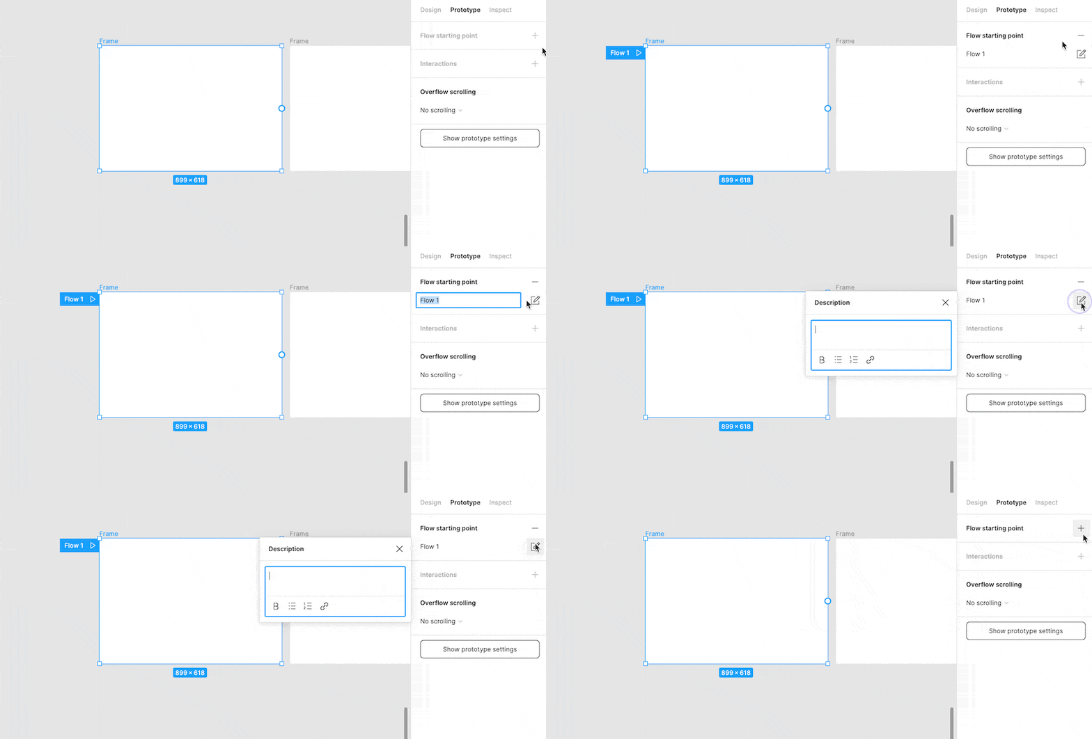
Once you have a clear understanding of the user flows and starting points, the next step is to add them to the prototype. You can use prototyping tools like Figma, Adobe XD, or Sketch to create interactive prototypes quickly. Make sure to include all the necessary screens and user flows in the prototype.
Add Interactions Fixed Position
After adding the necessary screens and user flows, the next step is to add interactions to the prototype. Interactions are the different ways a user can interact with the product, such as clicking on buttons, scrolling, or swiping.
It is essential to ensure that the interactions are intuitive and easy to use. Fixed position elements like navigation bars or buttons will improve the user experience as they will always be visible, no matter how far down the user scrolls.
Add Overflow Scrolling
Overflow scrolling is an essential feature in a clickable prototype. It enables the user to scroll beyond the visible screen and access additional content. Ensure that the overflow scrolling is smooth and seamless to provide a better user experience.
Overflow scrolling is a feature that enables you to scroll through specific frames in your prototype. It is useful when creating prototypes of UI components that have their own scrolling behavior, like lists, menus, tables, or carousels. To make use of overflow scrolling, you need a frame (not a group) containing nested content that extends beyond its boundaries. The excess content will be masked, and "clipped content" will be enabled.
figma clickable prototype example: carousel
Select a frame with overflowing content and choose "Horizontal Scrolling"
UI Prep Prototype Playground
UI Prep Prototype Playground
figma clickable prototype example: Menu
Select frame with overflowing content and choose "Vertical Scrolling"
UI Prep Prototype Playground
UI Prep Prototype Playground
How to Fix Position When Scrolling Figma?
Are you experiencing issues such as,
Why can't i fix position while scrolling on Figma?
or Fixed position when scrolling Figma not showing?
If so, we can help you resolve these problems.
At certain times, it may be necessary to keep an element's position fixed on your screen as you scroll through content. This is particularly useful if you wish to have a header or menu remain visible at the top of the screen while browsing or wish to retain an image's position while reading through a lengthy document. Thankfully, there are several ways to fix the position while scrolling in Figma.
1. Fixed Setting
This method found within the 'Layout' section of the 'Properties Panel'.
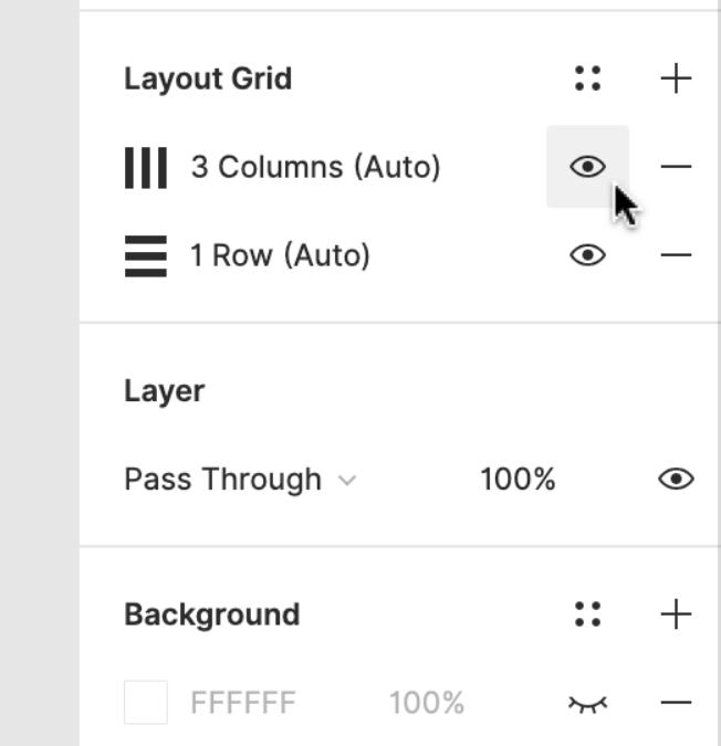
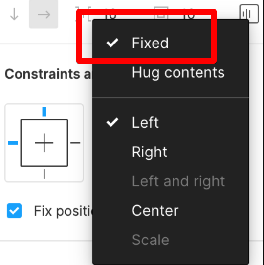
By enabling this feature, the element remains in its original position on the canvas, even as you scroll down.
This is perfect for ensuring that an important element remains visible at all times.
2. Pin to Page Setting
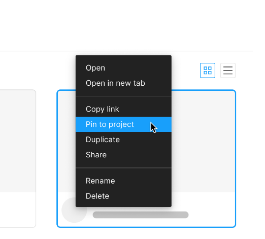
This can also be utilized to keep an element fixed in place until the end of the page, at which point it will move to the bottom of the screen.
This is ideal if you want the element to remain visible until the end of a lengthy document.
3. Sticky Setting
You can employ the 'Sticky' setting to maintain an element's position until it is scrolled past.
This will ensure that the element stays fixed to its current location until the user scrolls past it, after which it will become fixed to the bottom of the screen.
This is a great option if you want the element to remain visible for a specific period of time.
These are just a few of the methods you can use to keep an element's position fixed while scrolling in Figma.
We recommend experimenting with each method to see which works for you to fix position when scrolling figma not working.
How to Use Interactive Components in Figma?
Interactive components are pre-built design elements that can be used to create a more engaging prototype. They can include things like sliders, tabs, or pop-ups. Interactive components make the prototype feel more interactive, engaging, and real. It is essential to use them in the right places to ensure they do not overshadow the product's core features.
View Prototype
Once you have added all the necessary screens, user flows, interactions, fixed positions, overflow scrolling, and interactive components, it is time to view the prototype. Viewing the prototype will give you a better understanding of how it works and how users will interact with it. It is essential to test the prototype rigorously to identify design flaws and improve the user experience.
When it's time to test your designs, you can share the entire prototype or copy the link to a flow starting point.
Figma Clickable Prototype FAQs
Q 1. How can I access the prototype section in Figma?
Ans. To access the prototype section in Figma, simply click on the “prototype” bar at the top of the properties panel.
Q 2. What options do I have for customizing prototype interactions in Figma?
Ans. In Figma, you can customize prototype interactions by selecting a connection and opening the interaction detail window on the right side of the panel. You can then select triggers, actions, transitions, and other animation properties.
Q 3. Can I use images from the web or my library in my Figma prototypes?
Ans. Yes, you can select images from the web or your library in Figma. When the image is displayed, Figma will create a connection between the thumbnail element and the destination frame.
Q 4. What types of prototype animations can I use in Figma?
Ans. Figma offers a wide range of prototype animation options, including transition types like dissolve and smart animate.
Q 5. How do I change the starting frame in my Figma prototype?
Ans. To change the starting frame in your Figma prototype, simply click on the blue arrow on the frame to show the starting frame.
Q 6. Can I connect multiple elements in the same frame in my Figma prototype?
Ans. Yes, Figma allows you to connect multiple elements in the same frame using hotspots.
Q 7. How do I preview my Figma prototype?
Ans. To preview your Figma prototype, simply put it in presentation mode.
UI/UX Design Tools Used by Company Size
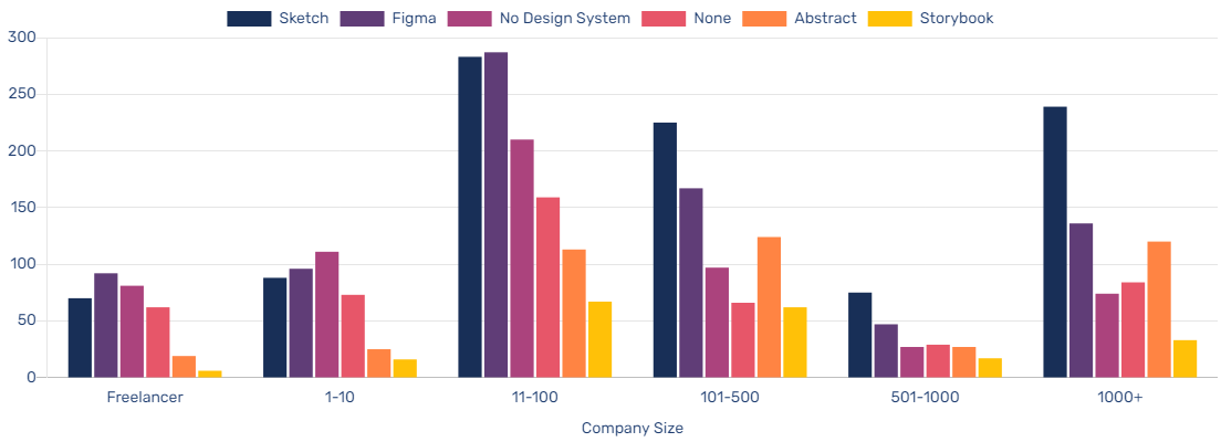
( See how companies similar in size to your own are stacking up their Design System tools )
The reference provided is a survey conducted in 2019 by UX Tools, where companies of various sizes were asked about their design system practices and tools. By using the survey results, the reference allows users to compare the design system tools used by companies similar in size to their own.
This information can be helpful for organizations in selecting appropriate design system tools and determining industry trends in design system adoption. It also provides insight into the popularity of various design system tools in the market and the potential benefits of using them.
Hire Top Figma Designers Trusted by Leading Businesses
Are you looking to hire the best Figma designer for your company? Look no further! As a UI/UX development company, we understand the significance of prototyping within the design process. Our team of skilled designers can assist you in creating interactive prototypes using Figma that bring your concepts to life. Our Web design services cater to your needs, whether you're designing a new application or want to revamp an existing website.
With RedBlink, you can hire top Figma designers who will produce clickable prototypes that will astound both stakeholders and users alike. Our commitment to excellence and design expertise has made us stand out as one of the best companies for UX designers.
Contact us today to learn more about how we can help you create interactive prototypes that will take your design to the next level.
Additional references related to clickable prototypes
- Heuristic evaluation versus end-user think-aloud protocol
- Real-Time Physical Prototyping Tool Design Based on Shape-Changing Display
- Building Clickthrough Prototypes To Support Participatory Design
- The Efficacy of Prototyping Under Time Constraints
- 2019 Design Tools Survey
Orthopedic Web Design Tips and Future Innovations [2024]
Orthopedic Web Design Tips and Future Innovations
The medical field is considered one of the competitive industries especially when it comes to orthopedic care. And thus, having a website is crucial to stay in touch with your patients/customers regularly.
However, simply owning a website does not guarantee its effectiveness.
Don't forget, an orthopedic website serves as a 24/7 virtual storefront for patients to learn about services and make appointments. And another fact is that nowadays, prospective patients even initiate their search online, even if they received a referral from their physician. They expect to see your website before booking or following through with an appointment.
So, how can you show your effectiveness before the customer reaches you as an orthopedic practitioner?
Well, a visually appealing interface, combined with user-friendly features, can help patients form quick opinions about your website. By prioritizing the user experience and creating a comfortable and informative environment, you can effectively convey information and build trust with your patients.
To ensure your website's success in 2024, follow this blog where we mention the best practices and key trends to build a strong presence in the orthopedic market.
Importance of Effective Web Design in Orthopedic Practices
Effective web design is crucial for orthopedic practices to establish a strong online presence and attract potential patients while ensuring HIPAA compliance. Here are some key points to keep in mind:
- A well-designed website provides intuitive navigation, engaging content, and a seamless user experience.
- It can help convey your expertise, solutions, and a patient-service-oriented perspective to a broad audience.
- It improves patient engagement, satisfaction, and loyalty, leading to positive word-of-mouth referrals.
- A poorly designed website not only violates HIPAA compliance but can also hinder your growth and reputation, causing patients to lose trust and seek services elsewhere.
- Ensuring HIPAA compliance in website design is essential for protecting patients' personal and medical information.
- Investing in website design is crucial for orthopedic practices to effectively communicate their brand and services, attract potential patients, and improve patient engagement and satisfaction.
Understanding The Orthopedic Market
Understanding the orthopedic market is essential for web designers to create effective websites for orthopedic practices. Here are some key aspects to consider:
-
Demographics of Orthopedic Patients
Orthopedic patients are typically older adults, athletes, and individuals with musculoskeletal injuries or conditions. Understanding their demographics and preferences helps in designing a website that caters to their requirements.
-
Compliant With HIPAA
HIPAA regulations dictate strict guidelines for protecting patients' personal and medical information. So, it ensures that the website design complies with HIPAA regulations to safeguard patient data.
-
Trends and Challenges Facing Orthopedic Practices
The orthopedic industry is constantly evolving, with new technologies, treatment methods, and patient expectations. Understanding the latest trends and challenges in the orthopedic industry, such as telemedicine, remote monitoring, and value-based care, can help in creating a website that aligns with the practice's goals and strategies.
-
Competitors in the Orthopedic Industry
Competitors to orthopedic practices include hospitals, other healthcare providers, and other practices. So, it's important to conduct thorough research to understand the competition and create a website that stands out from the rest.
Understanding the orthopedic market is critical to have a website that effectively communicates the practice's expertise, services, and patient-centric approach. Your website must meet the unique needs and preferences of orthopedic patients while also aligning with the practice's goals and strategies.
12 Expert Tips That Can Grow Your Orthopedic Practice
Your orthopedic website design must include essential elements to effectively communicate the practice's brand, services, and patient-focused approach to a broad audience. Here are some key factors that should be incorporated into your website:
1. Audit - How Your Current Website is Performing?
To begin the process of website evaluation for your orthopedic clinic, it is important to first consider your own preferences as a business owner. If you have an existing website, take some time to reflect on the following questions:
- What aspects of the design do you appreciate? What elements would you like to change or improve upon?
- What successes have you experienced with your current site? Are there any areas that could have been more successful?
- What is the primary purpose of your target audience's visit to your website?
- What information or actions are your visitors seeking when they access your site?
- Are there any technical issues that need to be addressed, such as broken links or missing pages?
- Are there any gaps in the information provided on your site that could be filled in future iterations?
Answering these questions can create a foundation for future website design and development that considers your preferences and your audience's needs. Additionally, analyzing your website's analytics can provide insight into the types of content that resonate with your audience and guide future updates.
2. Consider Your Audience’s POV
When considering your website, it is important to keep your target audience in mind. A helpful guideline to follow is to view your website through the eyes of your prospective clients or patients. Take a moment to assess each page of your site and ask yourself:
- Did I easily find the information I was seeking?
- Is it clear what actions I should take next?
- Can I quickly locate the necessary information?
- Was the page easy to scan for the information I needed?
If you answered “No” to any of these questions, your website might not be optimized to meet the needs of your target audience effectively. By taking the perspective of your patients or clients into account, you can identify areas of your site that need improvement and make the necessary changes to ensure a more user-friendly experience. Other things you can do:
- Understand your patients'/clients’ needs, preferences, and pain points.
- Consider your patients'/clients’ factors such as their age range, medical concerns, and technological proficiency while designing a website.
- Conduct market research, analyze website analytics, and gather patient feedback to provide valuable insights into your audience's perspective.
- Incorporate features such as easy navigation, clear calls to action, and informative content to enhance the user experience and increase the likelihood of converting visitors into patients.
This approach can guide you in making informed decisions and content repurposing throughout the web design process.
3. Consistent Branding
Maintaining consistent branding is critical for any business to establish a strong brand identity that sets the tone for all customer interactions. It is important to ensure that branding remains consistent across all touchpoints, including the website, to reinforce your value proposition and aesthetics.
This includes keeping the logo, color scheme, and messaging consistent, as well as maintaining the same brand voice and iconography. This way you can enhance your brand identity and develop brand equity, making consistency key to effective marketing.
4. Create Accessible & Inclusive Designs
When creating accessible and inclusive designs, it is important to consider various aspects of website design. These include:
- Responsive Design and Mobile Optimization
Responsive design is about creating websites that can adjust to different screen sizes and resolutions, from desktop computers to smartphones and tablets. It involves optimizing the website layout, content, and functionality for various devices.
Mobile First Design is a vital part of responsive design, which ensures that the website is optimized specifically for mobile devices, including touch screens and mobile-specific features such as easy navigation, quick loading times, and simplified layouts.
- User-Friendly Navigation
Navigation is a crucial design element on a website, impacting whether visitors stay or leave. To ensure visitors can easily access content, CTAs, and information, navigation should be simple and intuitive.
Using clear language and recognizable terms such as "About," "Services," and "Contact" can help avoid confusing users. For orthopedic practices, showcasing provider credibility is recommended through a visible "Our Providers" or "Meet Our Team" button leading to provider profiles that include education, certifications, experience, specialization, and publications.
- Visual Designs and Multimedia
Web users have short attention spans and prefer visuals to understand the content. To engage orthopedic patients, you should limit text and include plenty of visual elements such as images, gifs, and videos on your websites. Visuals help to quickly convey important information and make it easier for visitors to understand.
Product screenshots can be especially impactful in the orthopedic industry, helping patients understand the services offered. A balance between text and visual elements should be maintained on websites, with compressed and optimized images and videos including descriptive image alt text for accessibility.
- Typography, Color Scheme & Whitespace
Website design elements are crucial for improving the user experience. Typography, color, and whitespace are three important factors that must be considered while designing a website.
The typography should be legible, easy to read, and accessible to all users, while the color scheme should be consistent with the brand's identity and should aid in site navigation. Proper use of whitespace can help create visual breaks, reduce distractions, and allow users to focus on important information.
- Calls-to-Action and Contact Forms
It's great to have an appealing website, but how do you know if your visitors are actually doing what you want? Do they engage with your content? Here's where CTAs come in.
CTAs provide a way for visitors to easily access self-service areas of your site such as "Schedule An Appointment," "Complete Patient Forms," or "Pay Your Bill." By using clear headlines and easy-to-read drop-down buttons, both on desktop and mobile, you can increase the likelihood of visitors engaging with these important CTAs.
5. Accessibility
Can your website accommodate the diverse needs of patients/clients with varying levels of accessibility?
If not, you must prioritize accessibility in your website design. Accessibility in web design is necessary for individuals with disabilities such as visual, motor, auditory, speech, or cognitive disabilities. Consider using contrasting colors, alternative text for multimedia content, and keyboard navigation. Use text labels/patterns and font resizers for those with visual challenges, and make sure interactive content is navigable through keyboard scrolling.
6. Integration of Social Media and Other Marketing Channels
Integrating social media into web design can help promote services, increase brand awareness, engage with patients, and drive website traffic. Incorporating additional marketing channels such as email marketing, PPC advertising, and SEO strategies can further maximize online presence and attract new patients.
By combining these tactics, orthopedic practices can create a cohesive and effective digital marketing strategy. This approach can help businesses reach their goals and remain competitive in the industry.
7. Content Strategy and SEO
To make your website informative and easy to find, content strategy and SEO are crucial. Creating high-quality content, such as blog posts, articles, and videos that meet the informational needs of your target audience, is a key aspect of a solid content strategy.
SEO involves using relevant keywords, optimizing meta tags, and creating a website structure that is easily crawled by search engines to improve your website's visibility and ranking in SERPs. In the end, considering both content strategy and SEO in the design of your website can increase your chances of reaching potential clients or patients.
8. Security and Privacy Measures
To protect sensitive information and prevent data breaches, implementing SSL encryption, secure login portals, Captcha verification, and two-factor authentication is important. Clearly stated privacy policies should be available on the website to inform visitors about data collection and its usage.
The website should comply with industry regulations, such as HIPAA, to handle patient information securely. Ensuring a secure online environment can build visitors' trust and demonstrate a commitment to protecting their sensitive data.
9. Patient Reviews and Testimonials
Reviews and testimonials on your website are valuable tools to attract potential patients by showcasing the quality of your services and the experiences of other patients. They can help build trust and credibility, giving your practice an advantage over competitors.
Addressing common questions and concerns through reviews and testimonials can provide potential patients with the reassurance they need to make an appointment. Incorporating patient reviews and testimonials into your web design can increase traffic to your site and expand your patient base.
10. Use Data and Analytics to Inform Design Decisions
Website metrics provide valuable insights into the needs and preferences of a website's target audience. Analyzing user behavior, demographics, and engagement rates can guide design decisions.
For example, if a large percentage of the audience uses mobile devices, prioritizing mobile optimization in the design may be necessary. By tracking user behavior, the most popular and effective pages and features can be identified to tailor the website to better serve the audience's needs.
11. Collaborate With Industry Experts and Stakeholders
Collaborating with industry experts and stakeholders is highly beneficial for orthopedic practice owners designing a website. These experts can provide valuable insights into industry trends and best practices, and offer feedback on design and content.
Engaging with orthopedic surgeons, physical therapists, and patients ensures the website aligns with practice goals and values while meeting audience needs and preferences. Working with web design professionals experienced in orthopedic practices provides valuable guidance and expertise for effectively communicating expertise, options, and a patient-first approach.
12. Staying Up-to-date With Industry Trends and Innovations
Staying updated on the latest technology and healthcare practices is crucial for orthopedic practice owners to improve patient care and increase efficiency. In addition to tracking industry trends and innovations, they can adjust their strategies accordingly based on their identification of opportunities and challenges.
Participating in professional organizations, attending conferences, and engaging with industry experts can provide valuable insight and keep practice owners informed. This way orthopedic practice owners can stay ahead of the competition and provide top-notch care to their patients.
Latest Innovations Influencing Orthopedic Website design in 2024
As an orthopedic practice owner, it's important to keep up with the latest innovations in web design to provide the best possible user experience for your patients. Here are some of the latest innovations in orthopedic web design:
- Virtual and augmented reality: VR and AR technology allow patients to virtually tour the facility, explore treatment options, and even undergo simulations of procedures before committing to surgery.
- Blockchain: Blockchain innovation in Orthopedic web design involves leveraging blockchain technology to enhance the security, transparency, and accessibility of data related to patient health records, clinical trials, and medical device inventories.
- Artificial intelligence and machine learning: AI and machine learning can help predict patient needs and offer personalized treatment options based on their medical history and preferences.
- Chatbots and virtual assistants: Chatbots and virtual assistants provide patients with 24/7 access to appointment scheduling, medical advice, and general information.
- Cloud Computing: It involves utilizing cloud-based servers to host and manage the website, allowing for greater scalability, accessibility, and security. This can enhance the user experience and enable seamless access to information and services for patients, healthcare providers, and other stakeholders.
- Patient Portals and Electronic Medical Records: Patient portals and EMRs provide patients with secure access to their medical information and allow them to communicate with their healthcare providers.
- Interactive animations and 3D Graphics: Interactive animations and 3D graphics can help patients understand complex medical concepts and procedures in a visual and engaging way.
- Big Data: It refers to the use of large data sets and advanced analytics to improve the design and functionality of orthopedic websites. By analyzing user behavior and preferences, you can create personalized experiences, optimize website performance, and enhance patient engagement.
- Voice search optimization: Voice search optimization can help patients find the information they need quickly and easily using voice commands.
- Personalized Content and Patient Education: Providing personalized content and patient education can help patients feel empowered and engaged in their own care, leading to better outcomes.
Hence, these innovative technologies in your orthopedic website design can provide a seamless and engaging user experience for your patients and stand out from your competitors in the industry.
RedBlink - Give Your Orthopedic Website a New Look!
It's essential for orthopedic practices to have a visually appealing and user-friendly website to attract and retain patients in today's digital age. By following the best practices discussed in this article, orthopedic practices can revamp their business websites to improve their online presence, increase patient engagement, and ultimately, grow their business.
If you're looking to give your orthopedic website a new look, consider working with a reputable healthcare website design company like RedBlink. Based in California, USA, RedBlink specializes in creating custom websites tailored to the unique needs of orthopedic practices. With our expertise in website design, development, and digital marketing, we can help your practice stand out in the competitive orthopedic industry and attract new patients to your practice.
Don't let an outdated website hold your practice back. Schedule an appointment with RedBlink today to learn more about our services and how we can help you elevate your online presence and grow your practice.
Redblink is a leading healthcare website design agency that specializes in developing HIPAA-compliant mobile apps and websites for plastic Surgery, physical therapy, ophthalmology, and other healthcare professionals.


